LMN / Rebrand
Case study
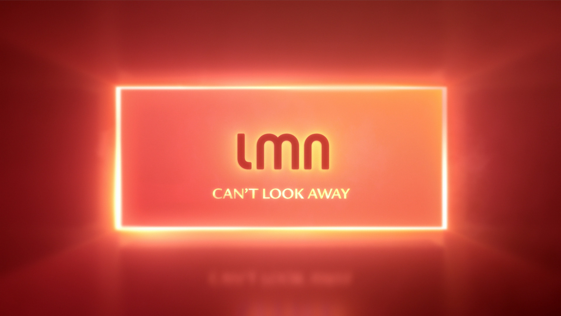
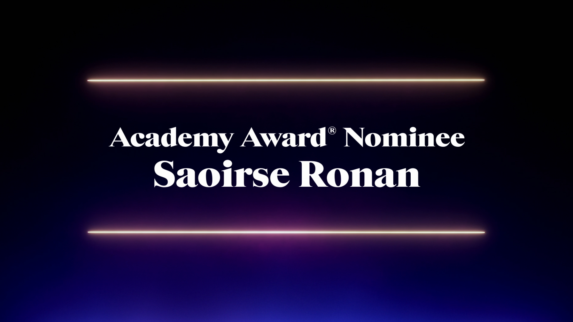
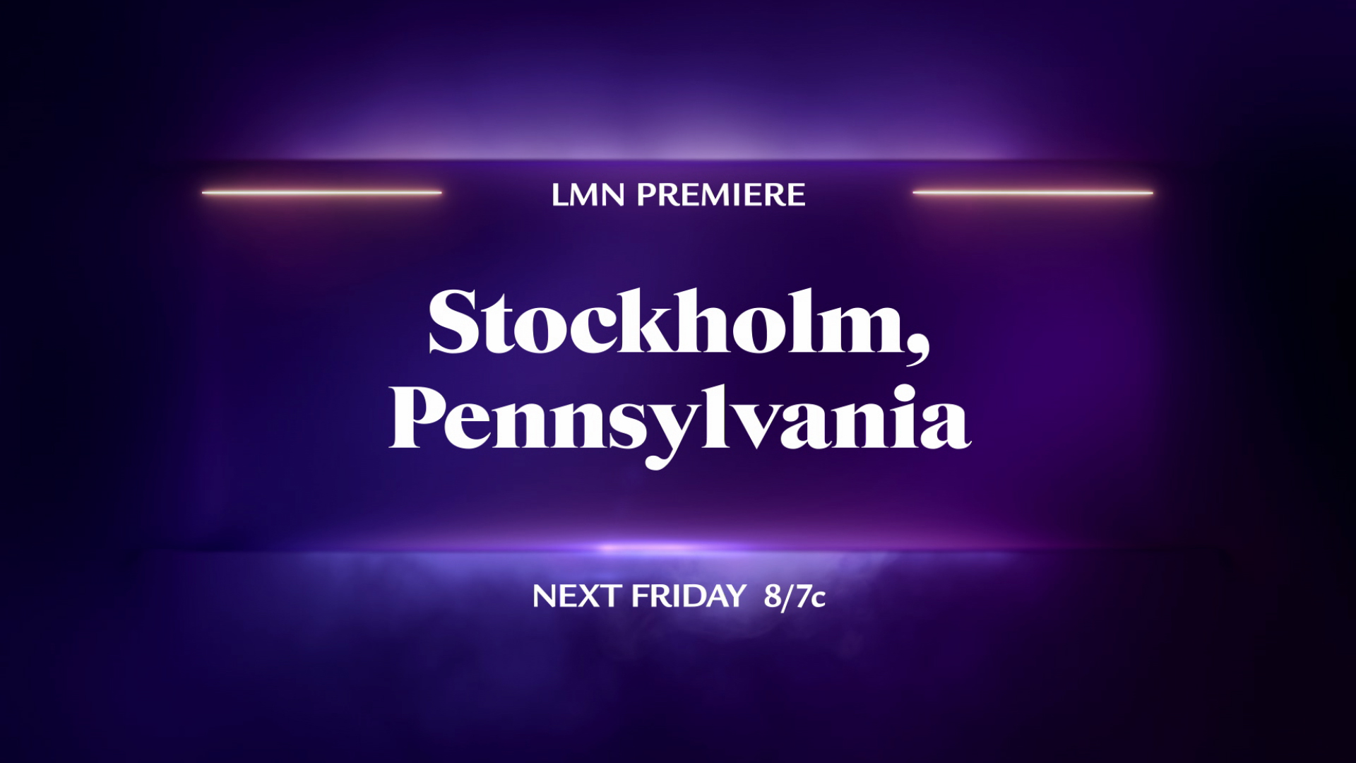
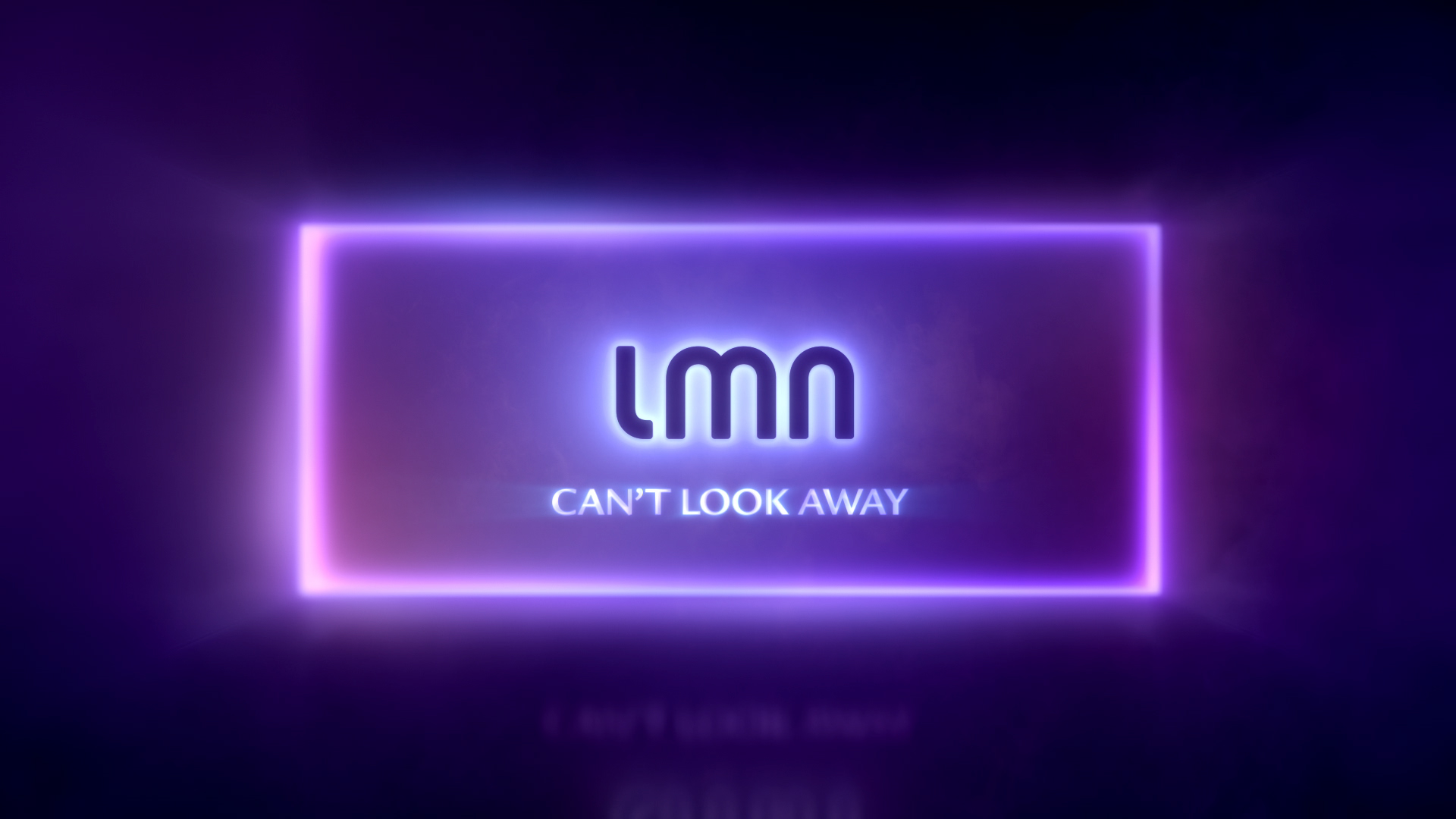
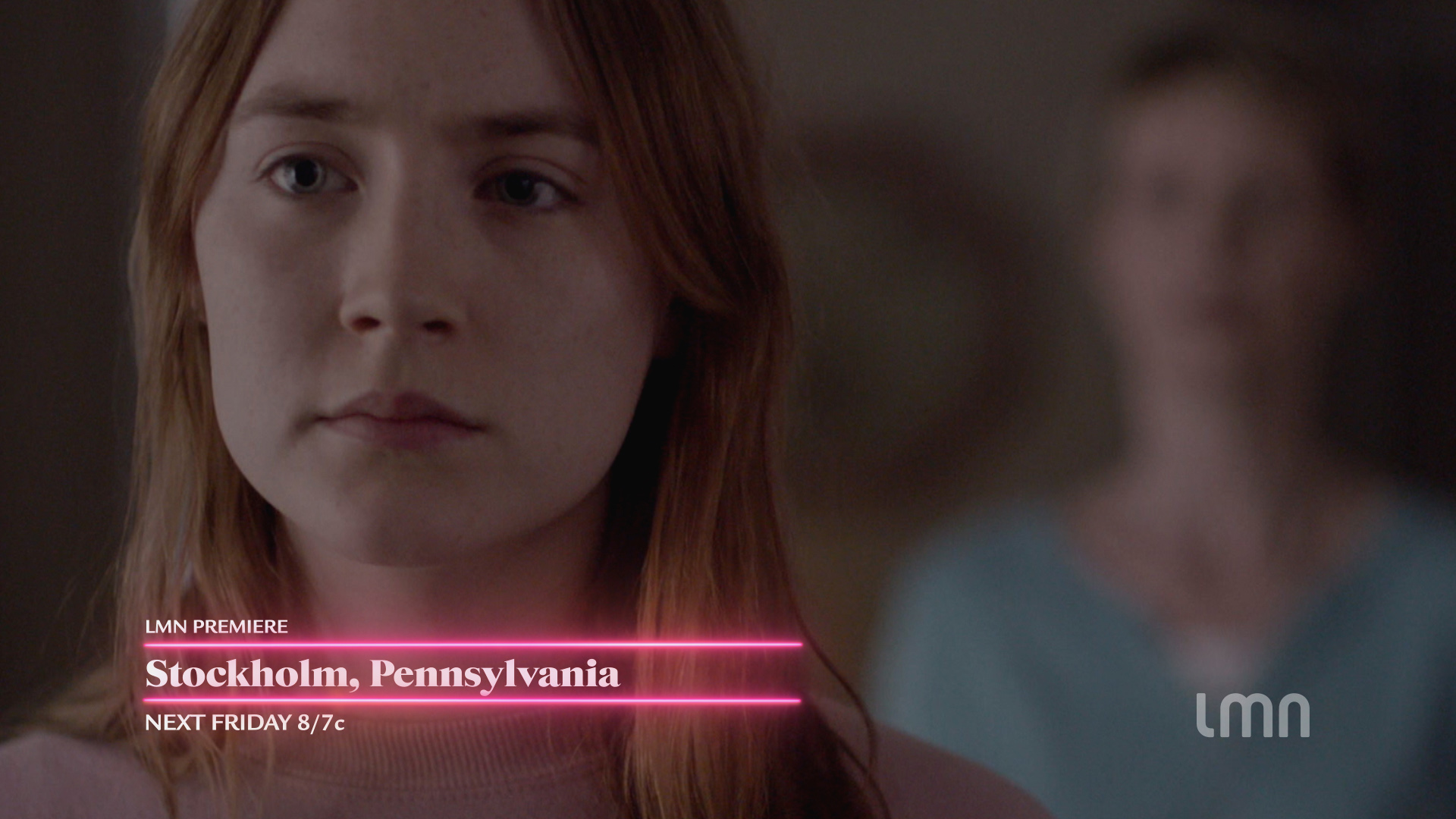
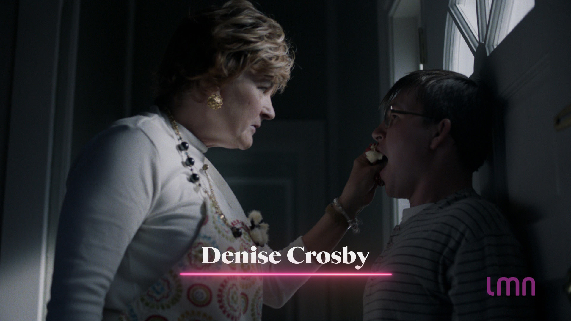
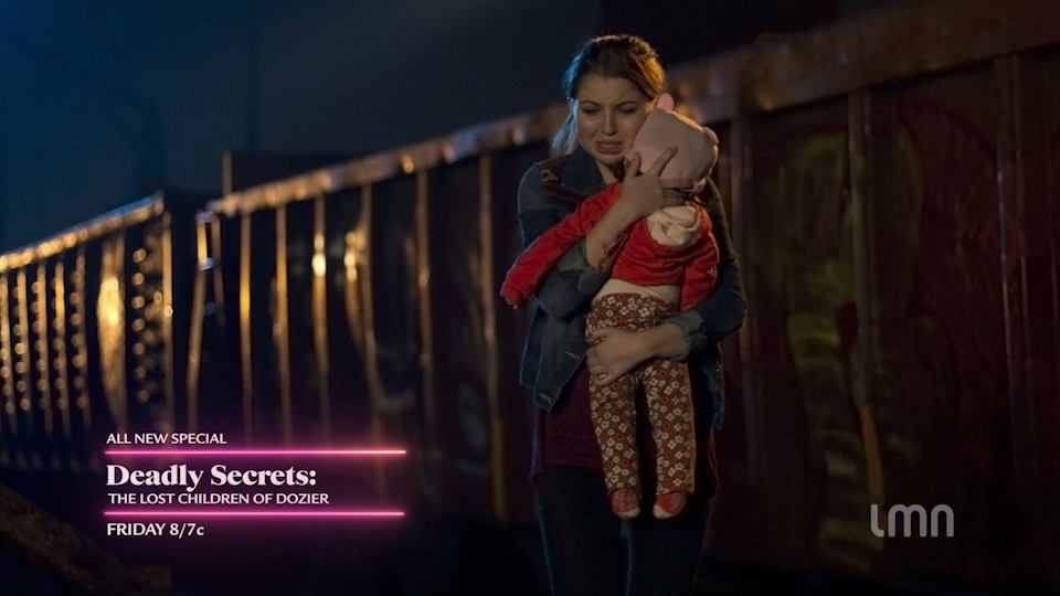
LMN, the movie-centric channel of the Lifetime family, invited us to revamp the channel’s identity to reflect the sophistication of its growing audience. Our focus in updating the identity was to create a unique, compelling look for LMN that lived up to its tagline ‘Can’t Look Away.’ The rebrand identity needed to feel true to brand’s evolving direction, be easy to use both in-house and out, and be adaptable across all media, simply and efficiently. LMN’s new look needed to say, confidently and clearly, that LMN is more than a guilty pleasure.


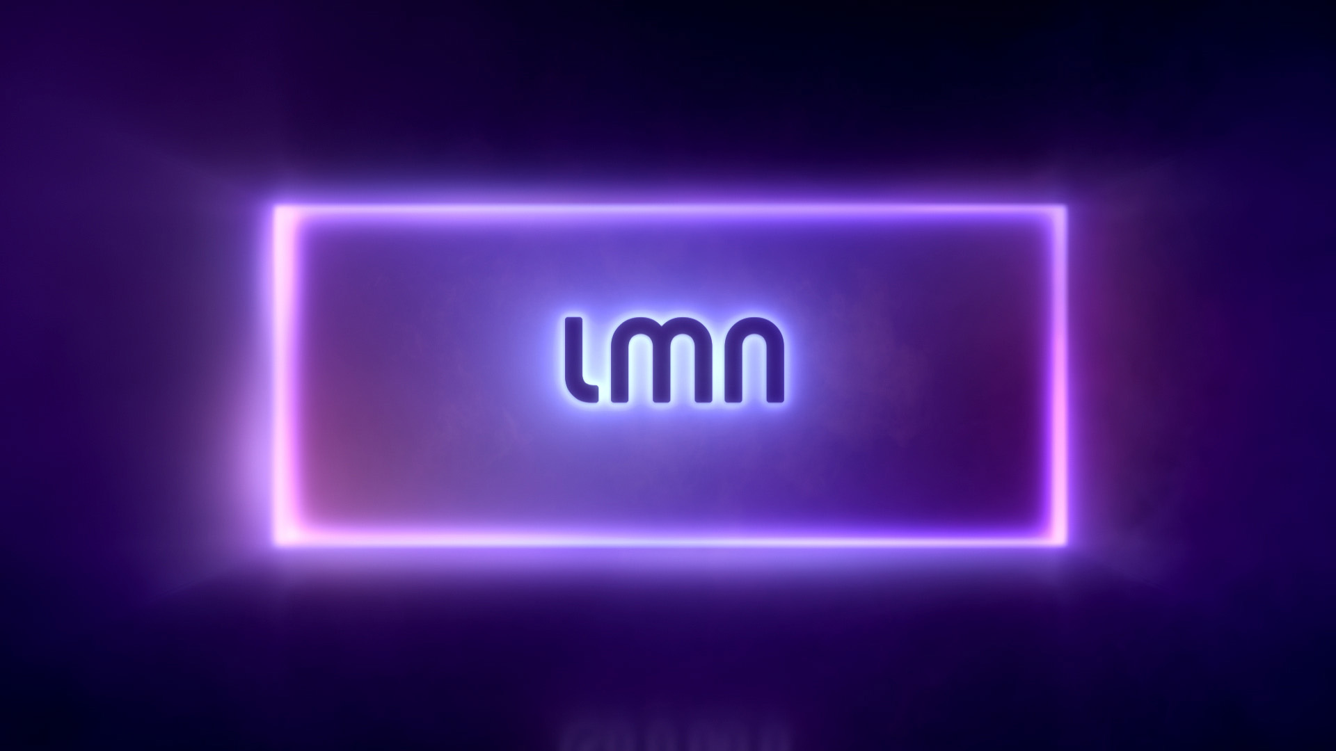
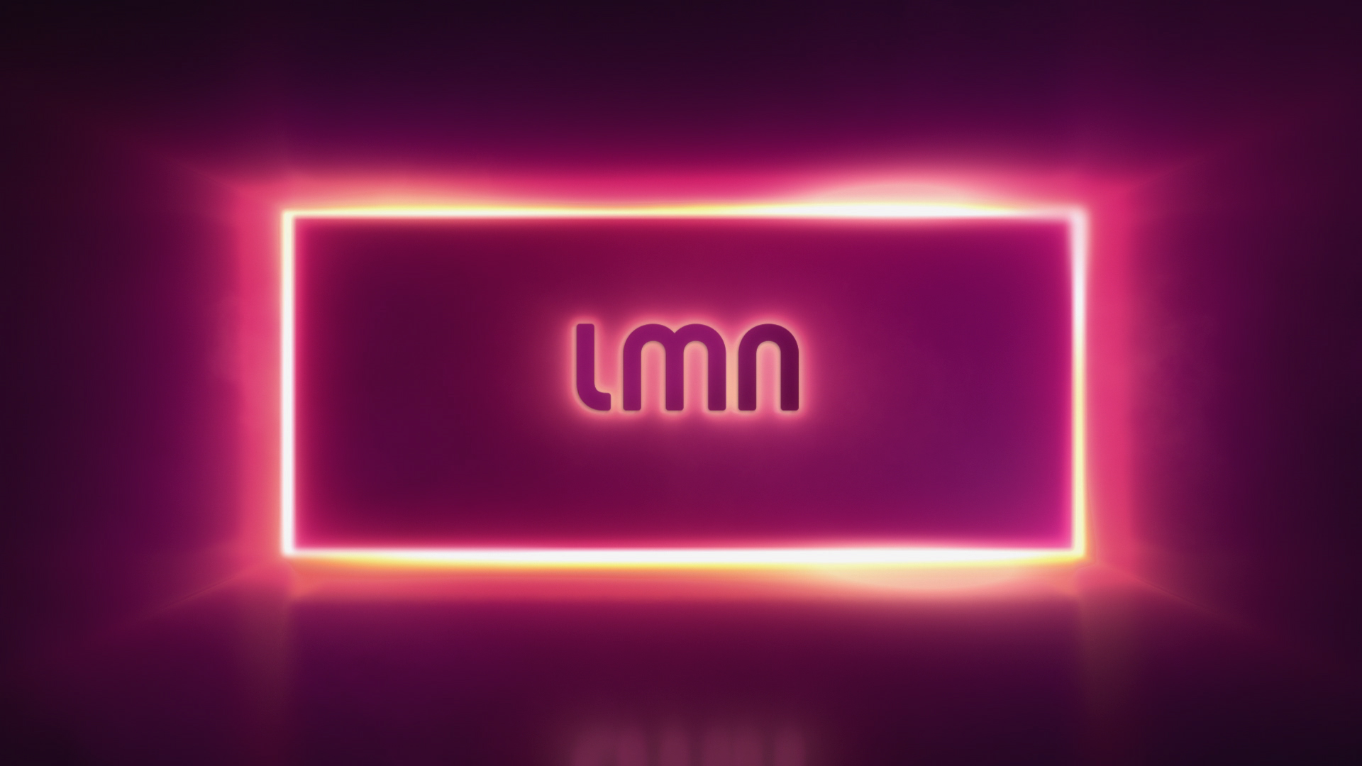

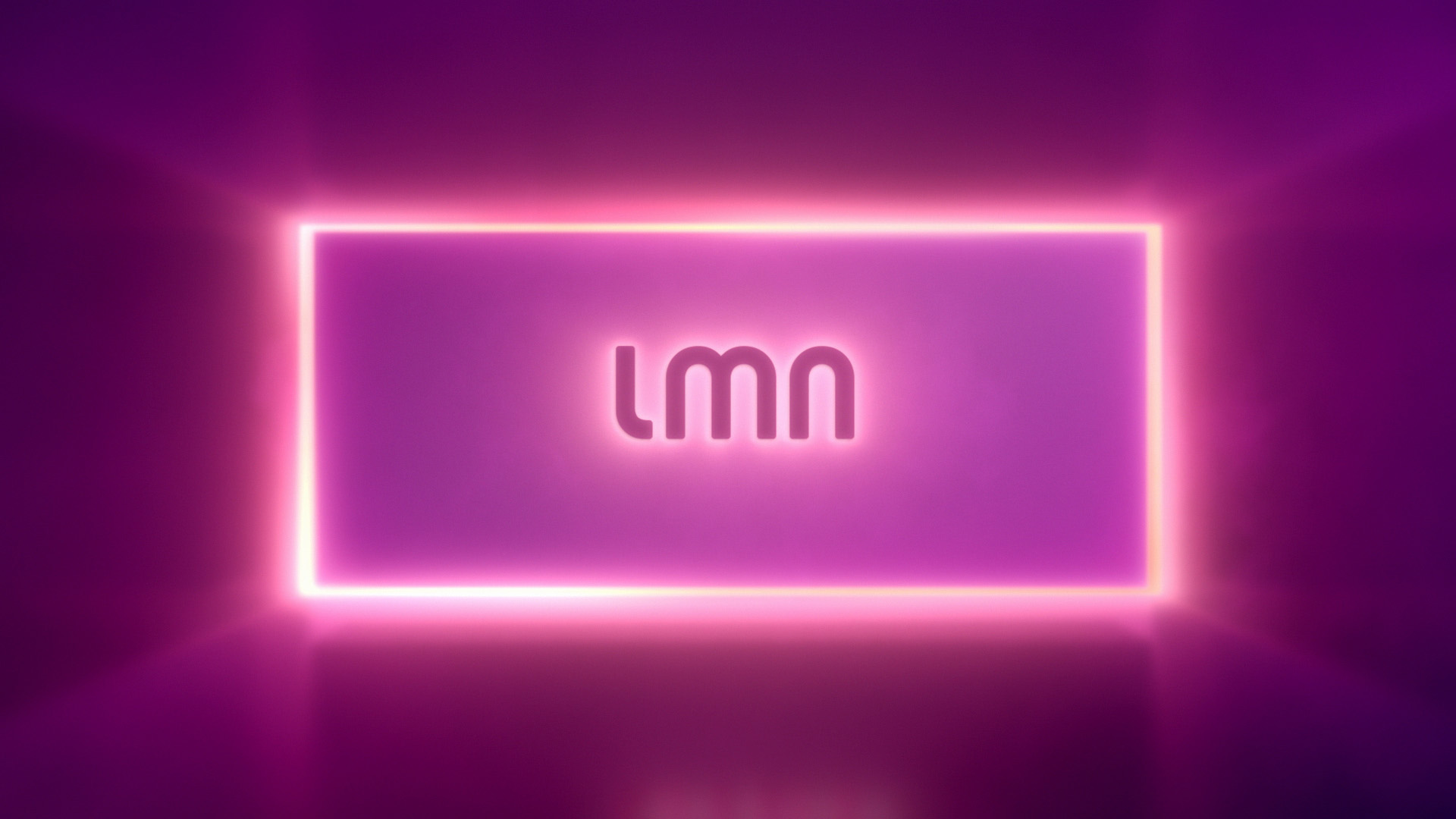
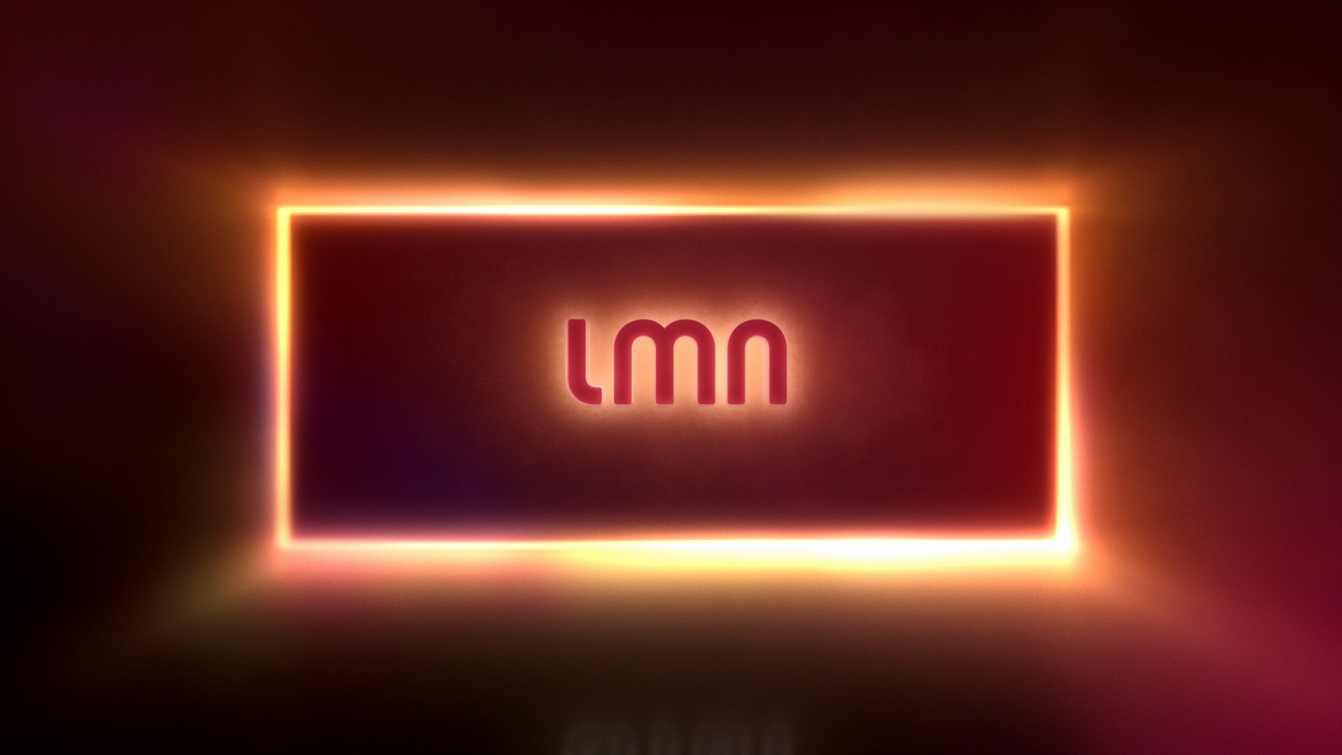
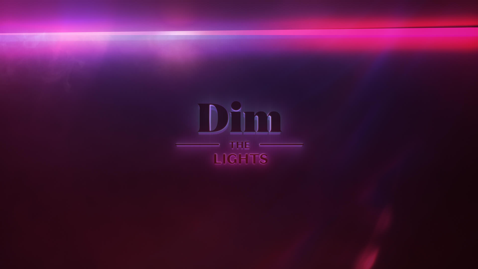
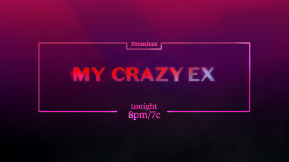
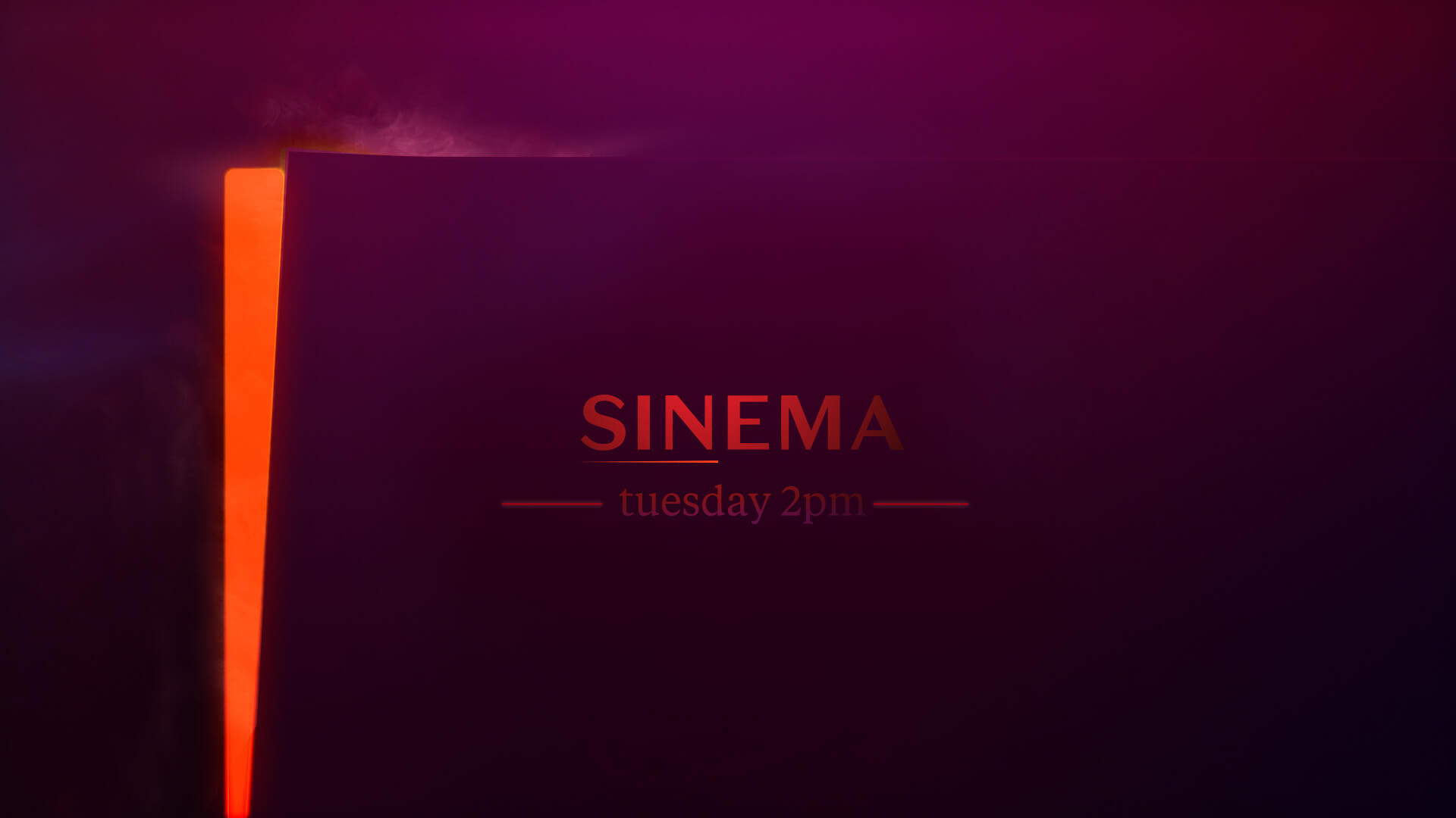
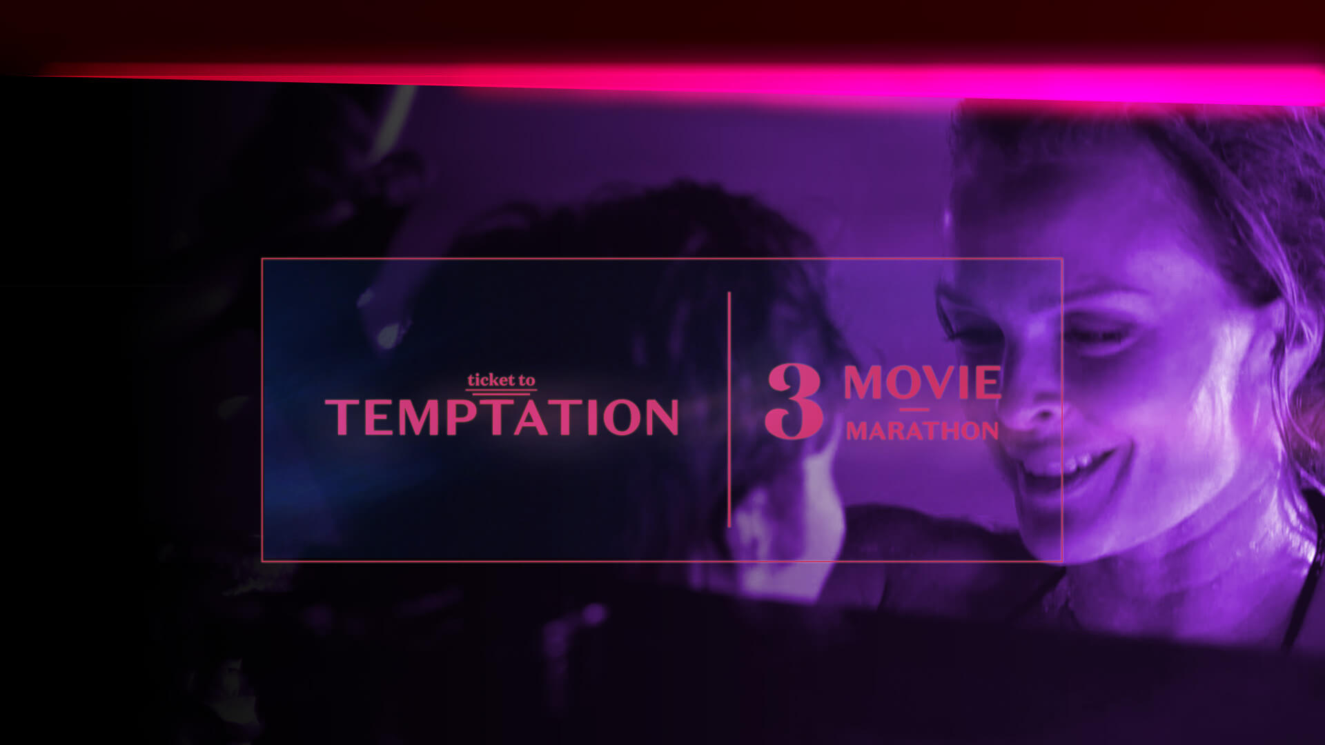
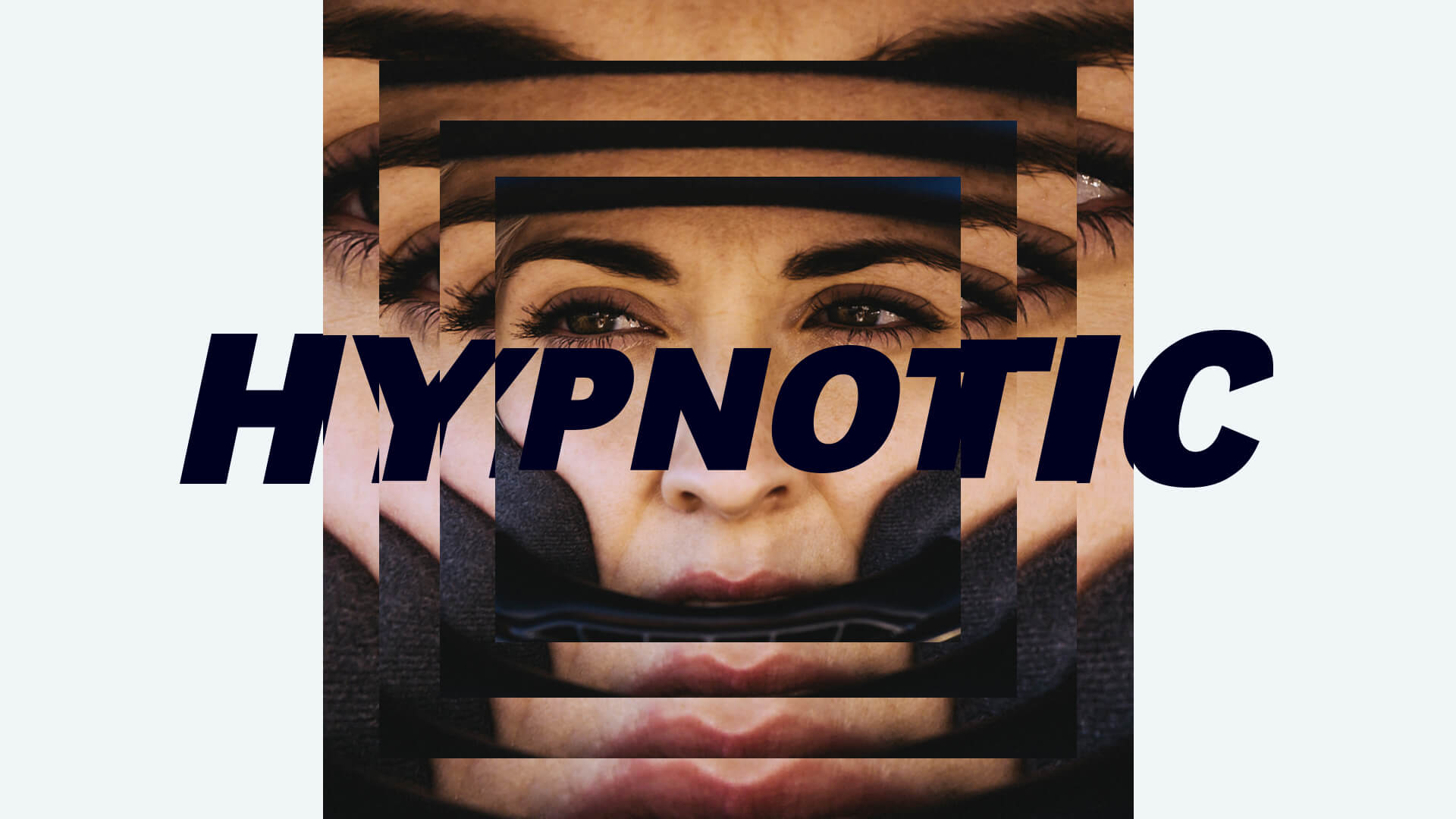
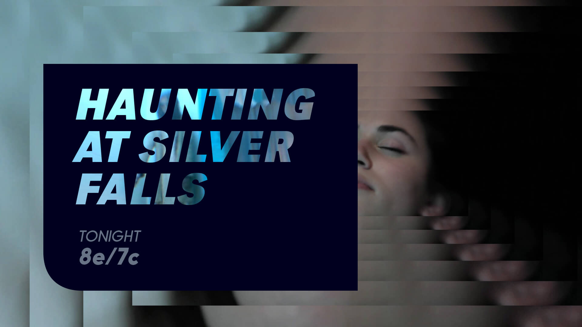
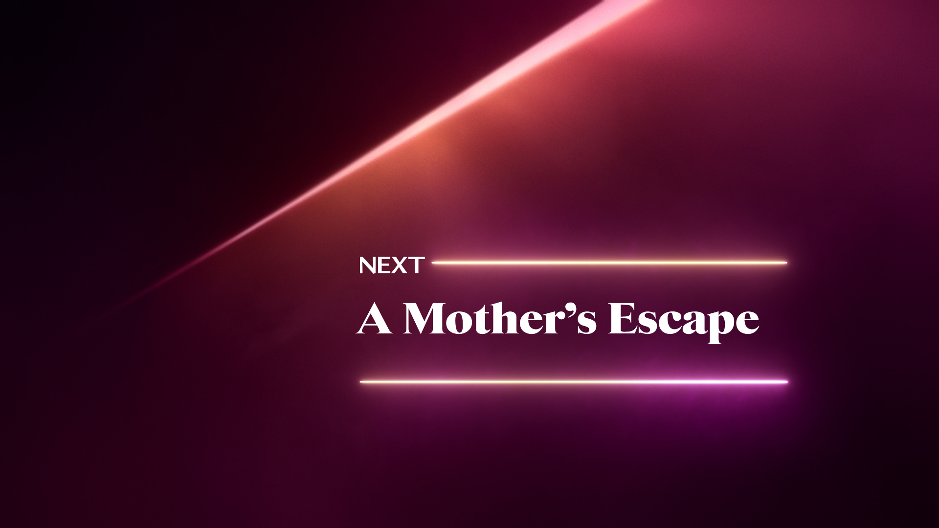
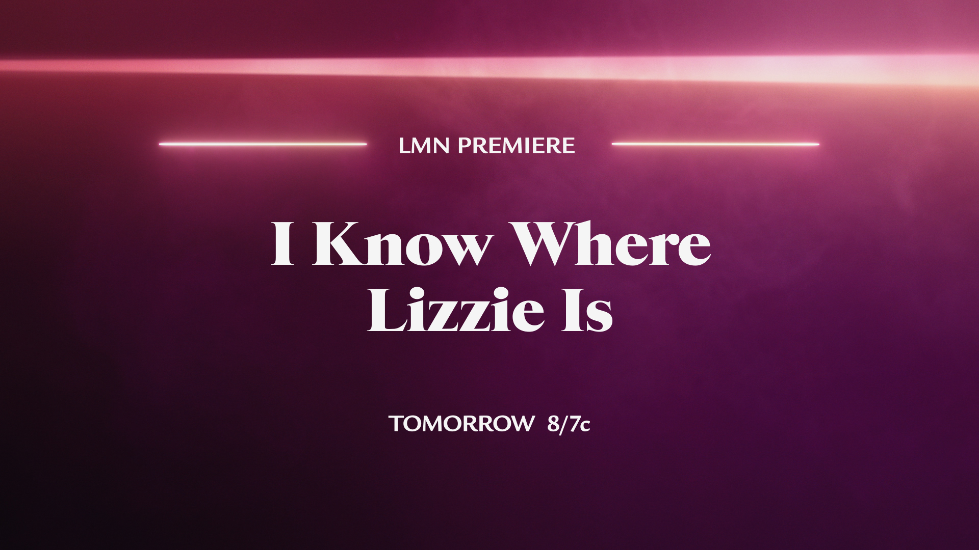
CONCEPT: ’DIM THE LIGHTS’
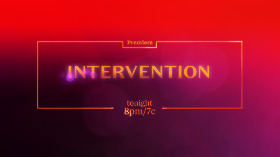
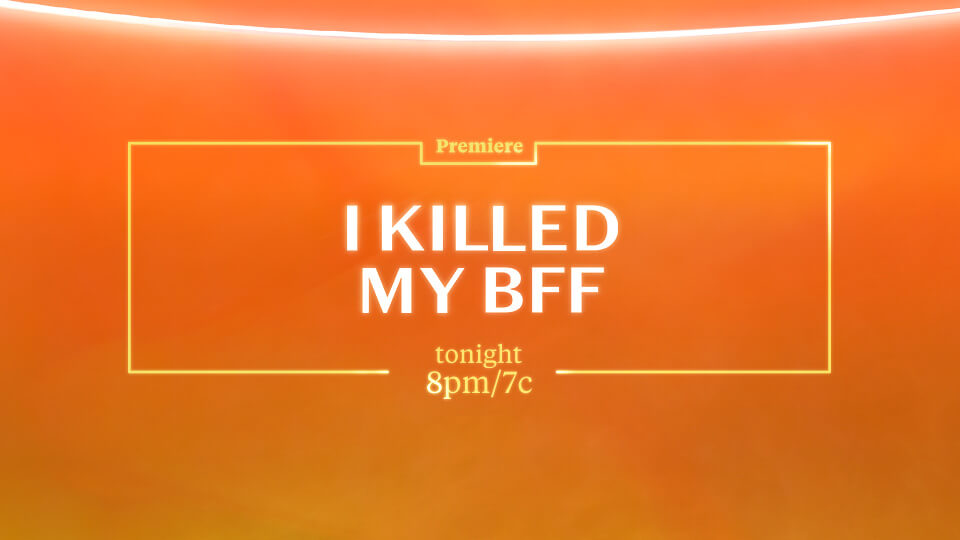
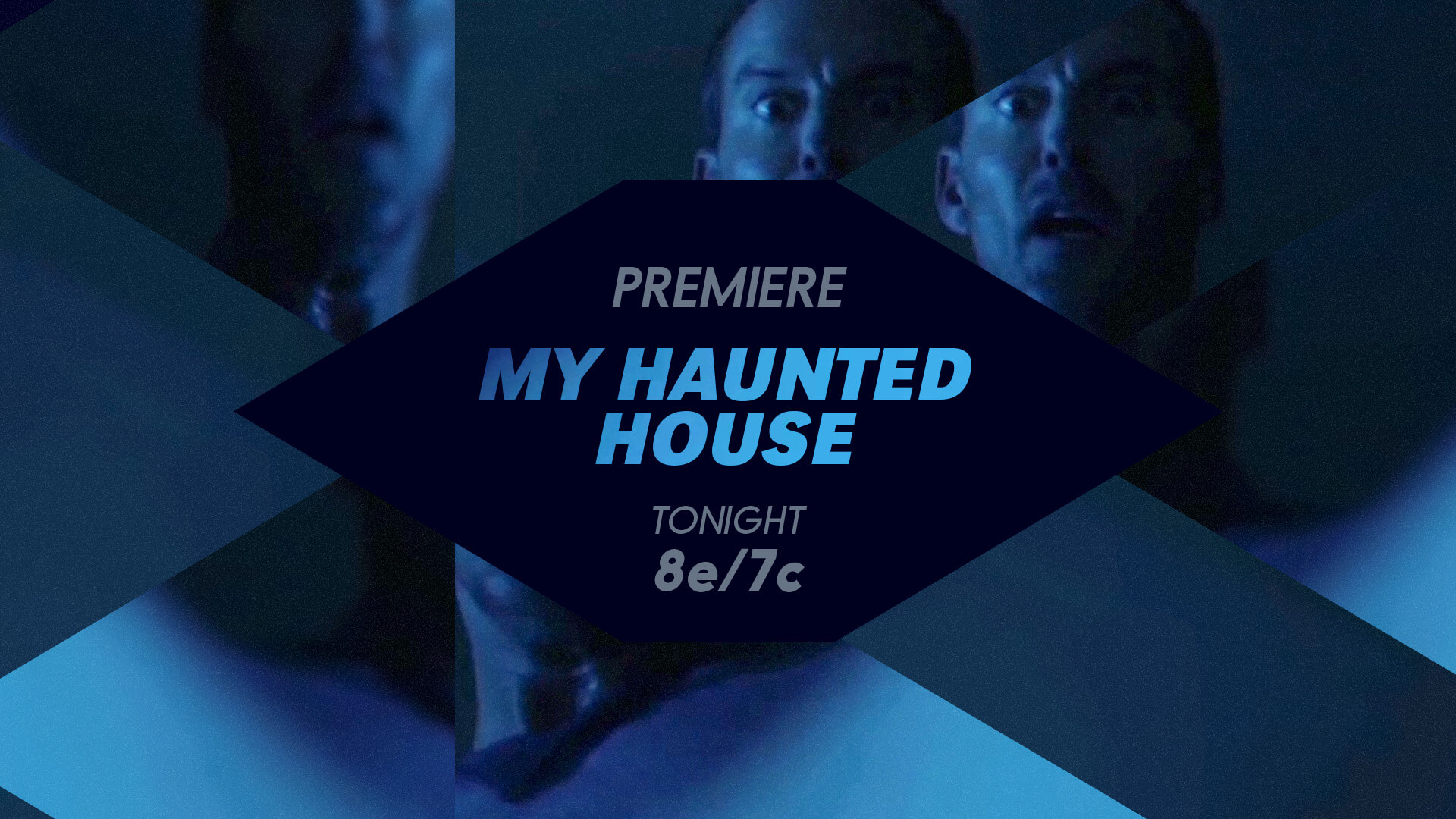
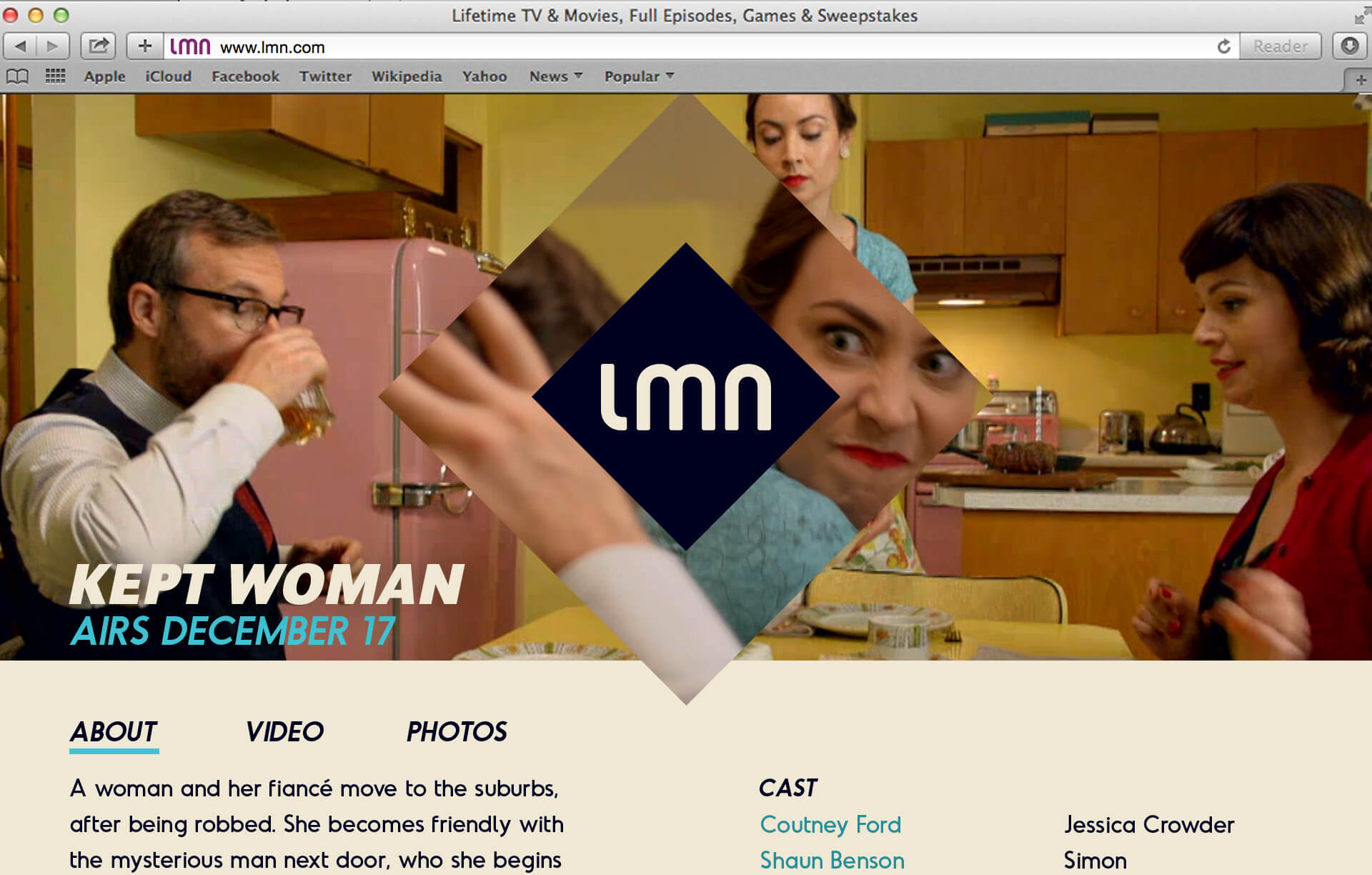
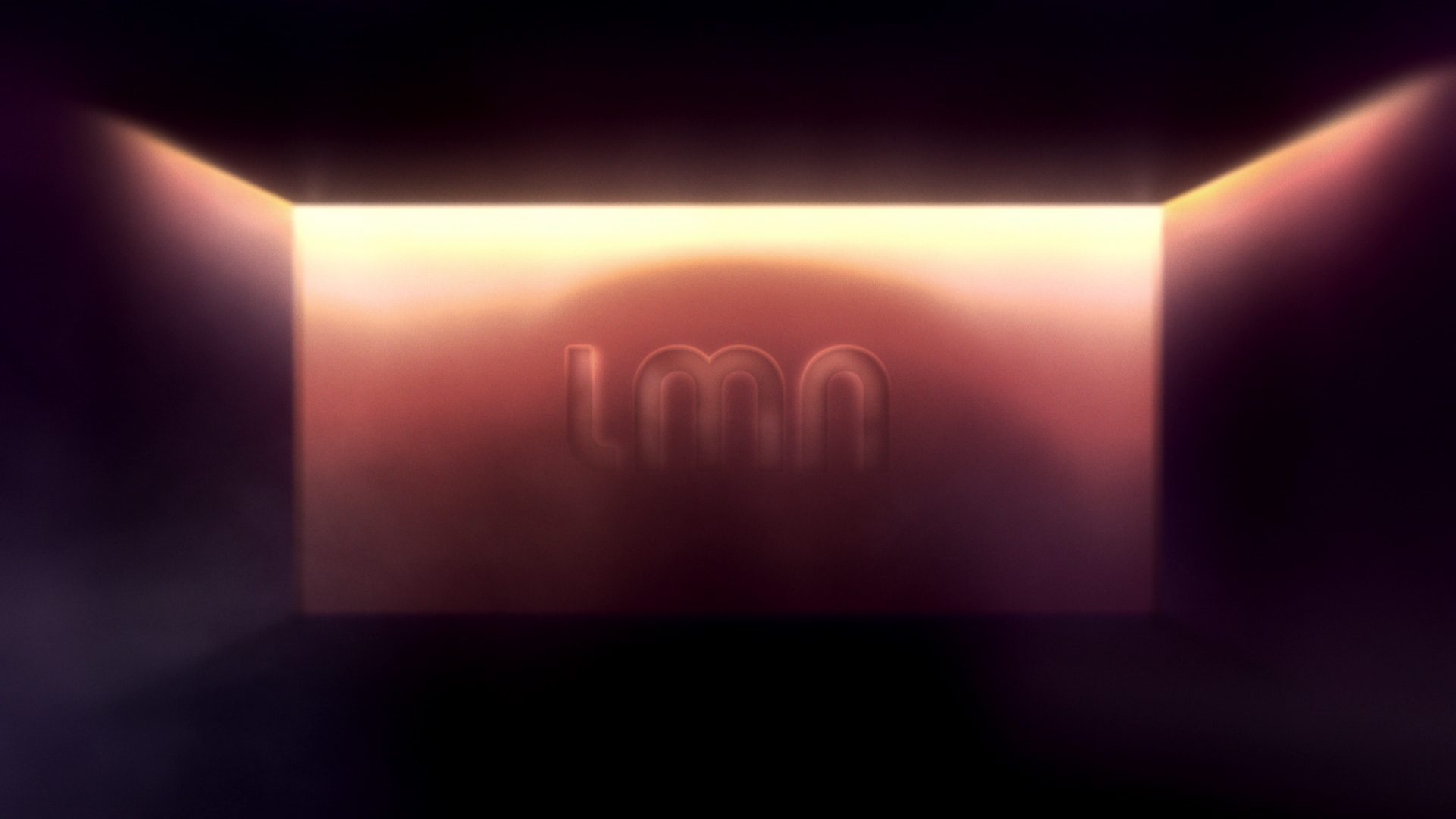
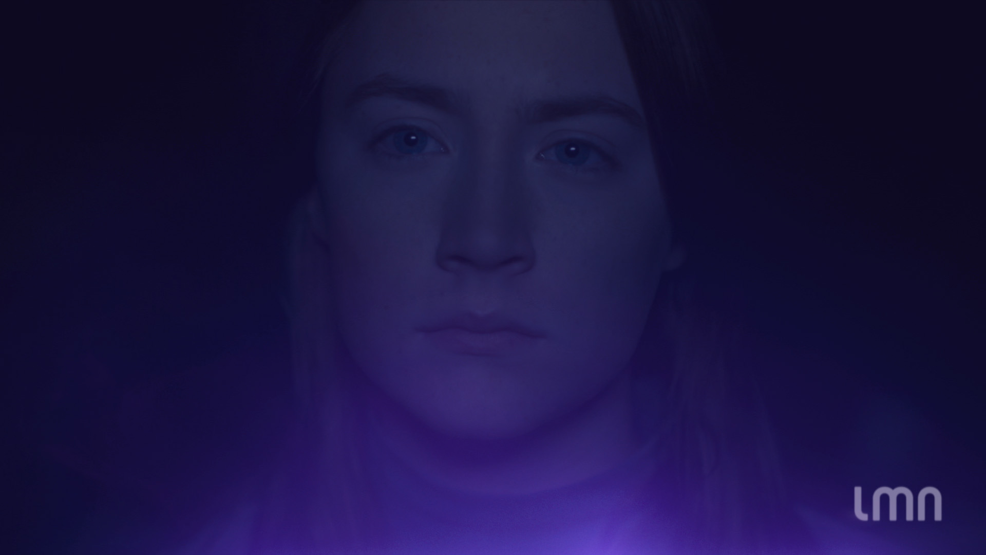
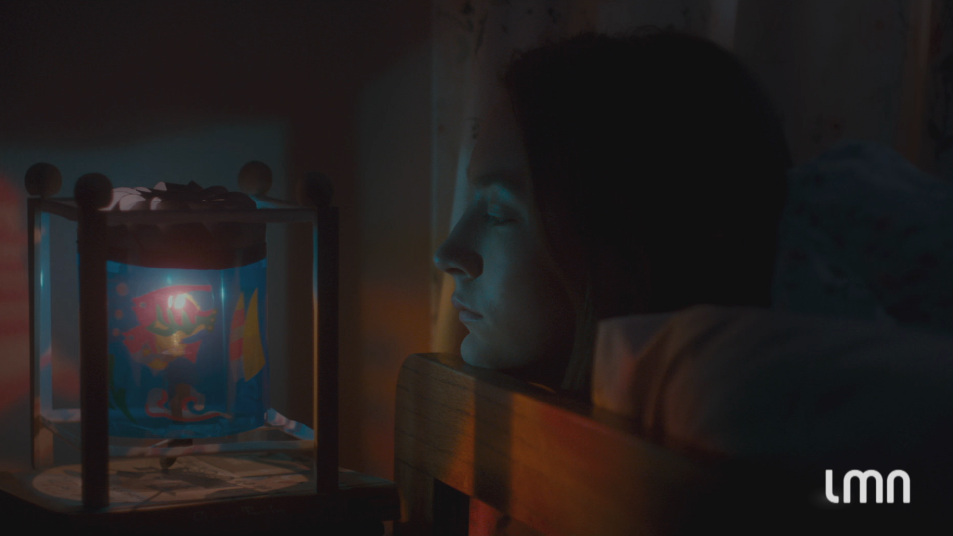
Our solution was inspired by the moment when the lights go down in a movie theater – the moment that draws you in with the promise of riveting drama, intense emotion, and passion rarely experienced in everyday life. We brought that moment to life with gradients that dim from light to dark, suggesting the dimming of house lights.


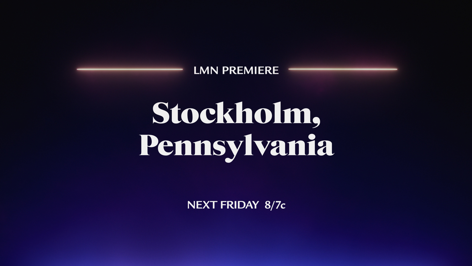
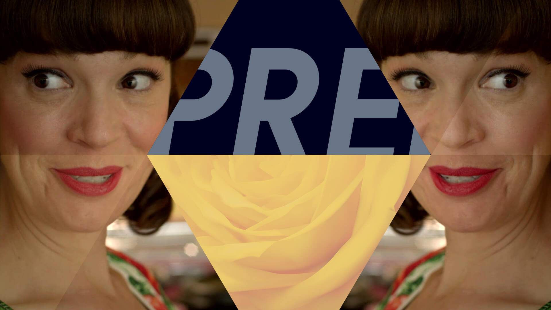
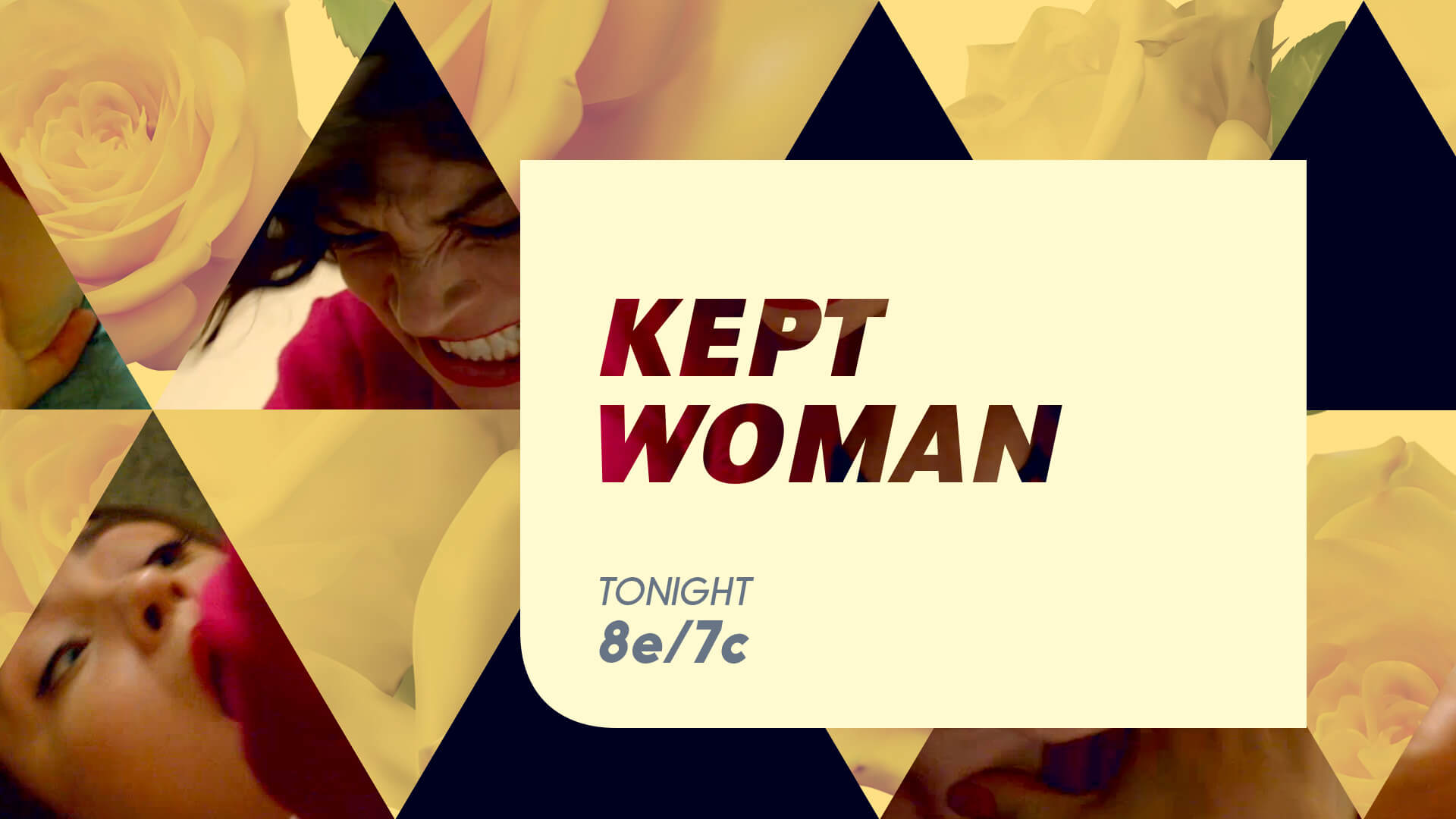
A wine-inspired palette of colors shifts to reflect the varied themes and moods of LMN’s shows, movies and promos – from Rosé to Shiraz.

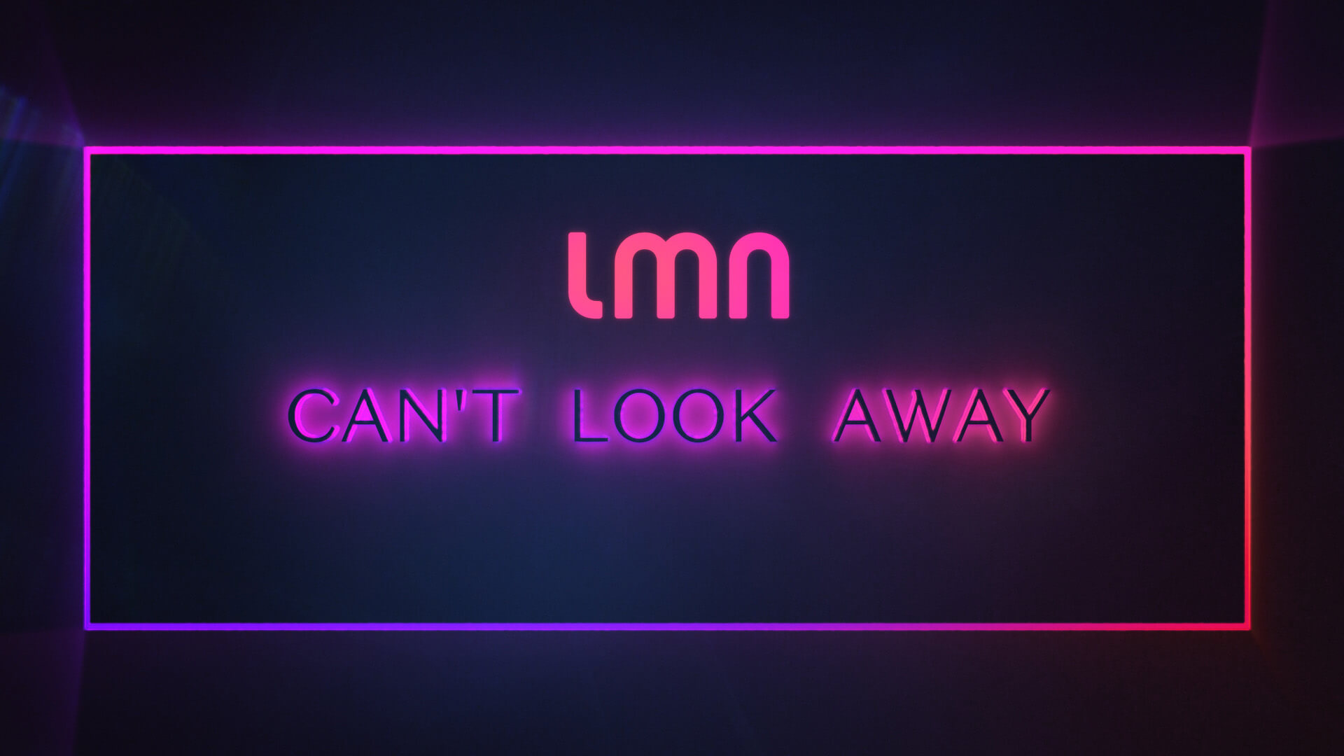
These elements combine in an understated, abstract space inspired by ‘that LMN moment’ and the golden age of cinema glamour to create an experience from which you “Can’t Look Away.”


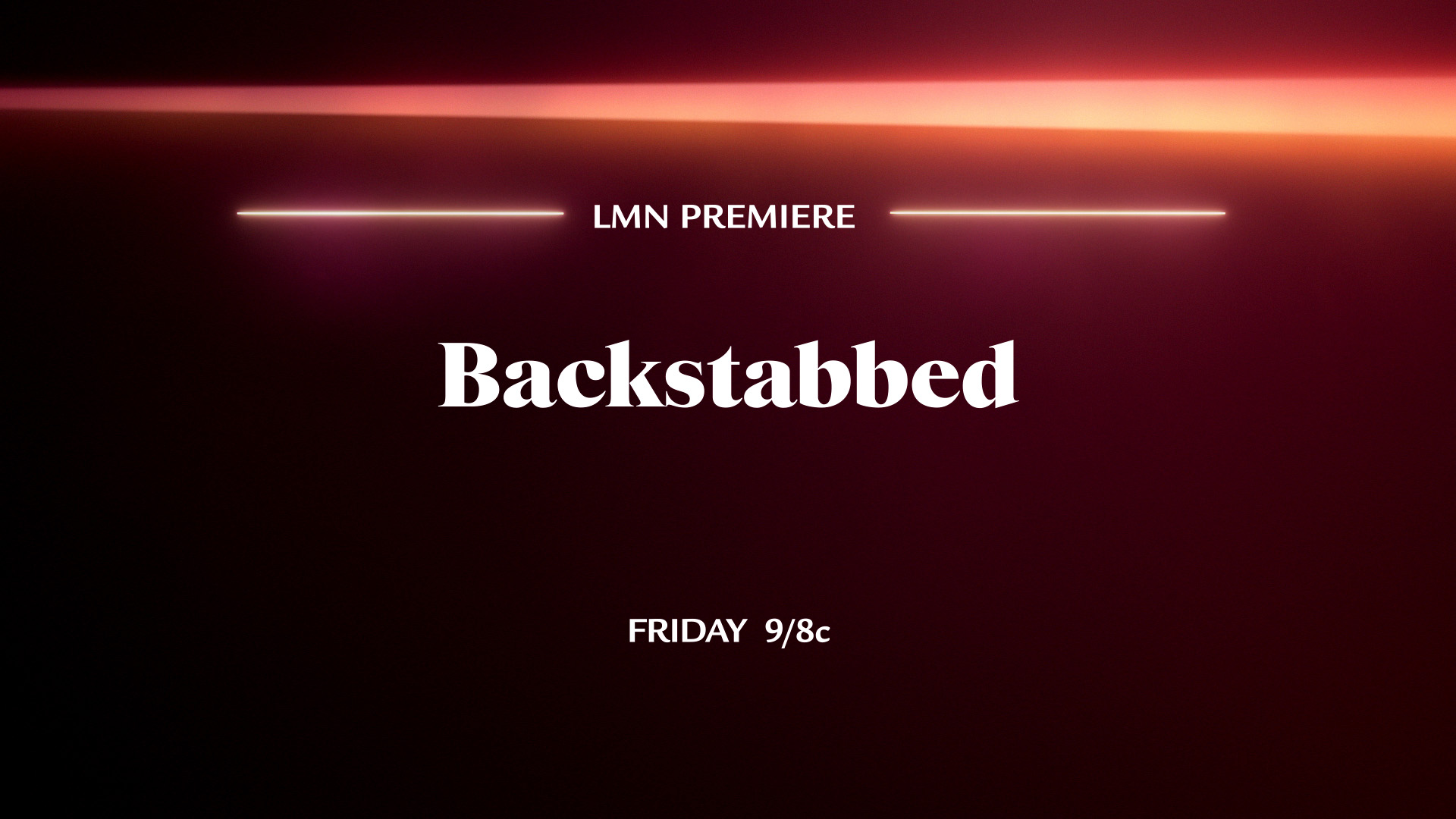
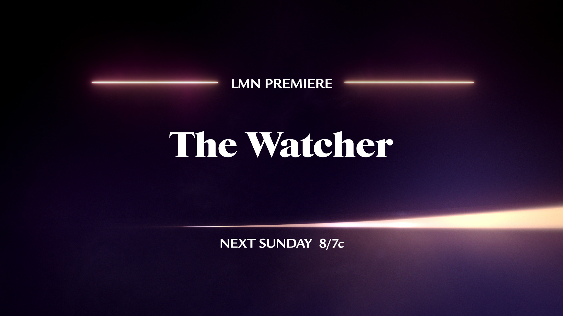
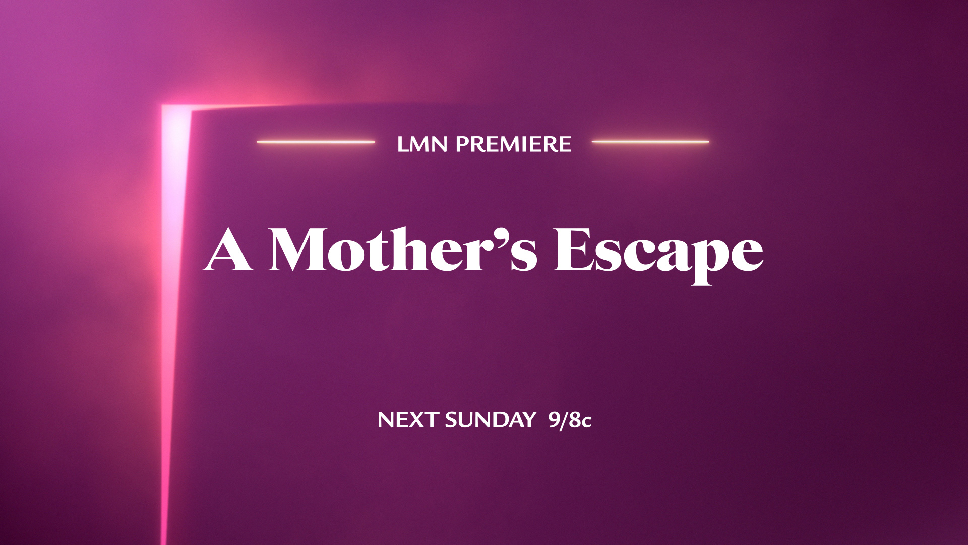
MONTAGE
SOCIAL MEDIA


CREATIVE DEVELOPMENT