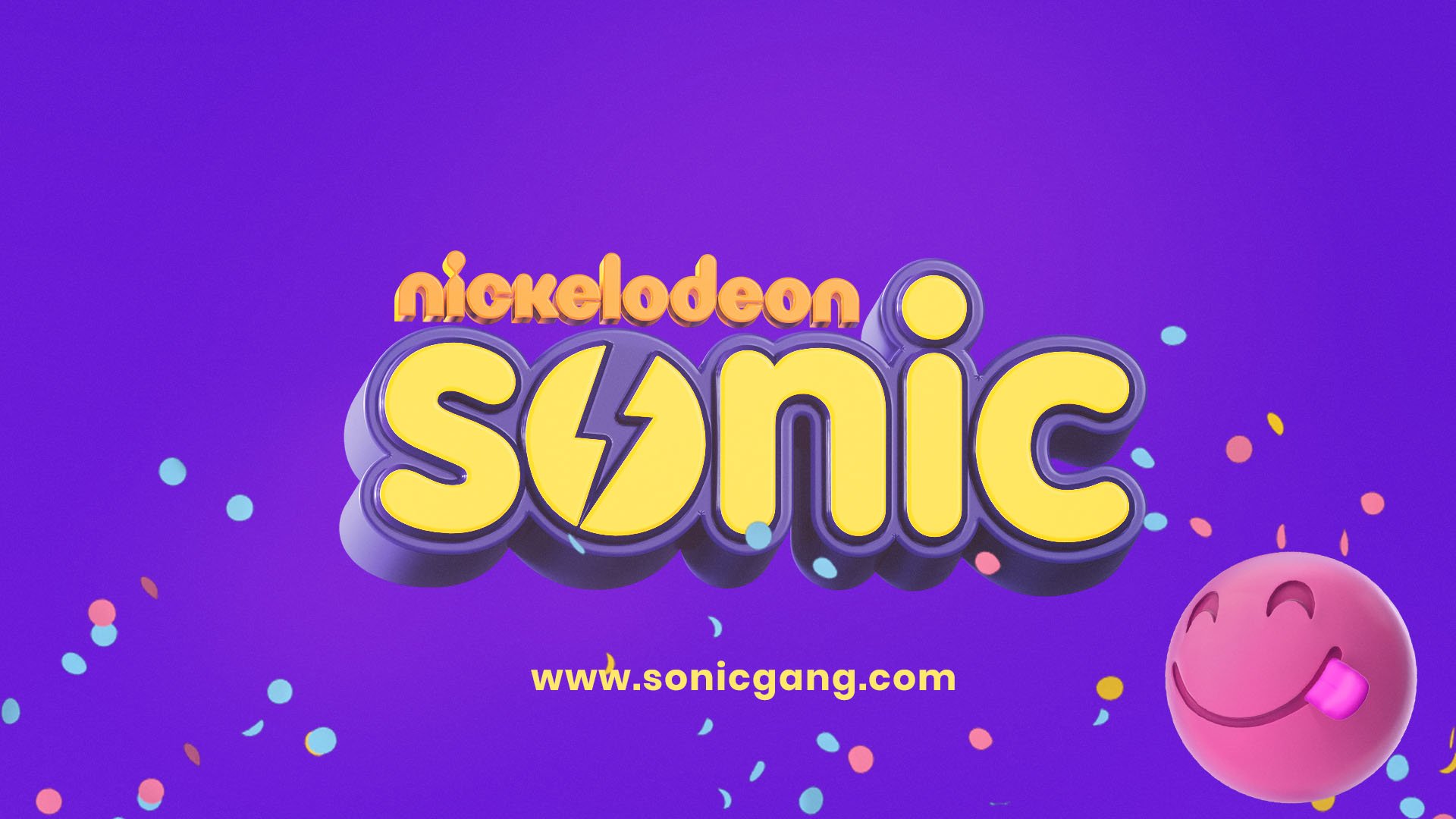
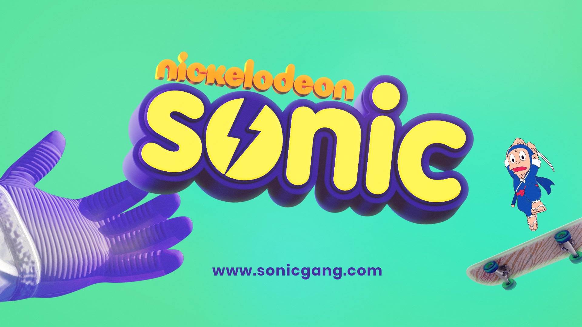
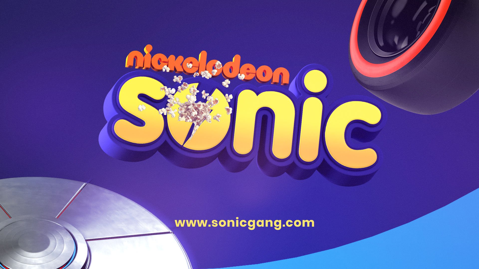
SONIC, NICKELODEON INDIA / Rebrand
Case study
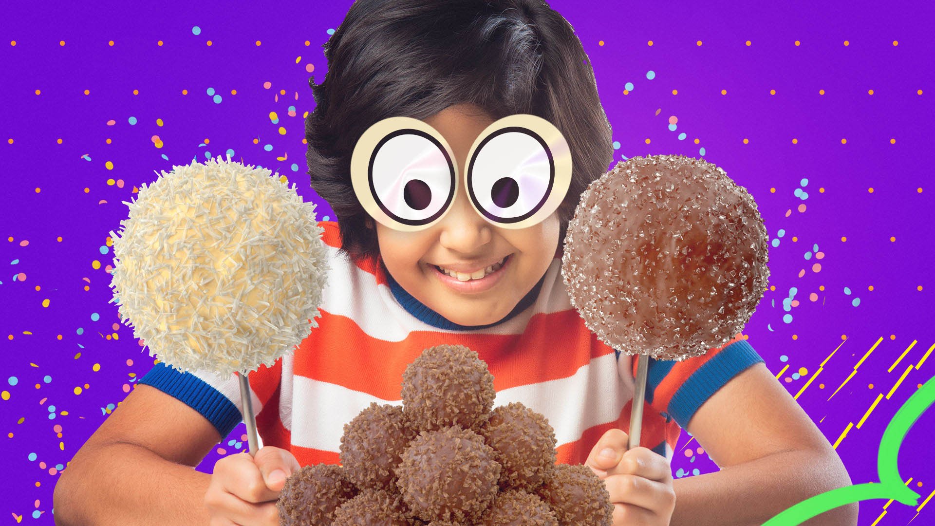
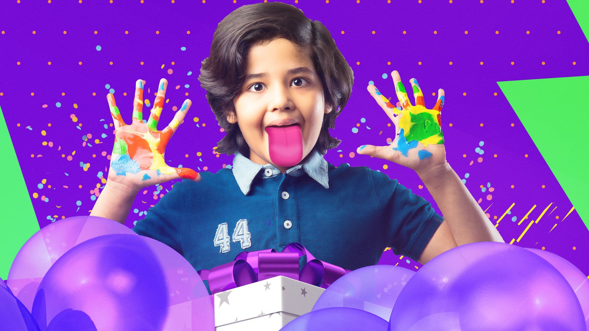
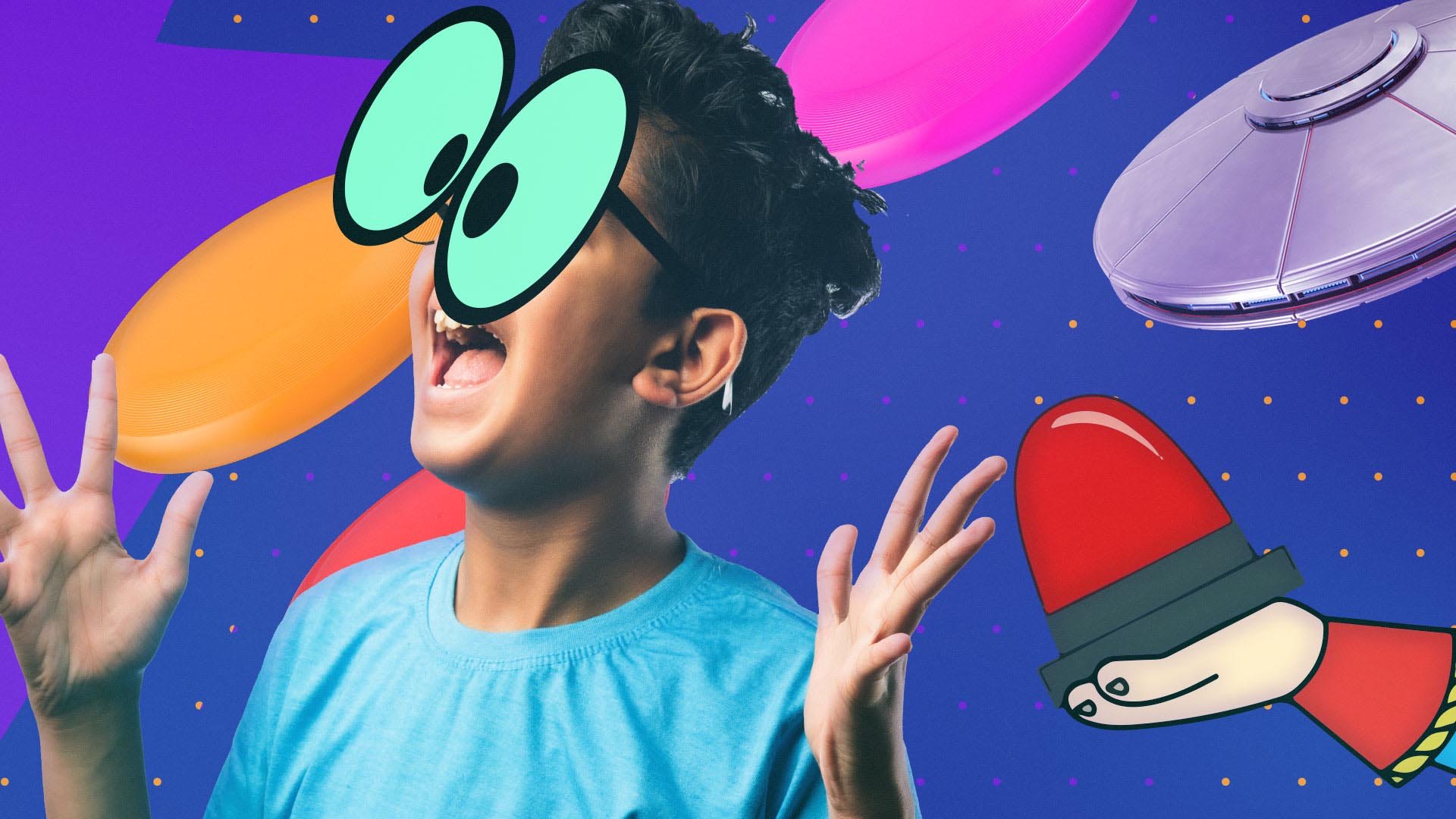
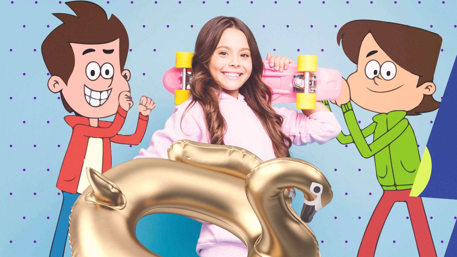
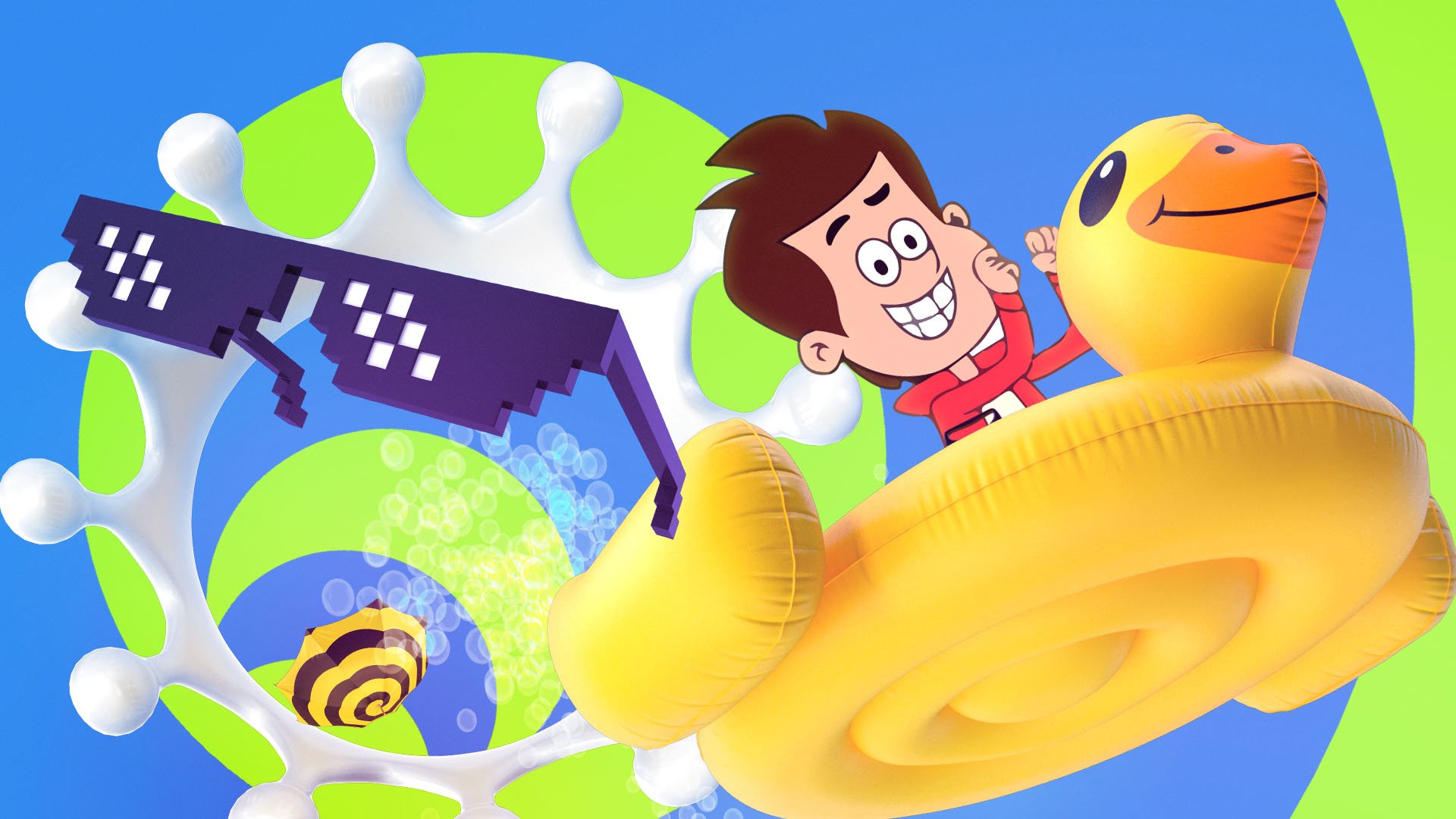
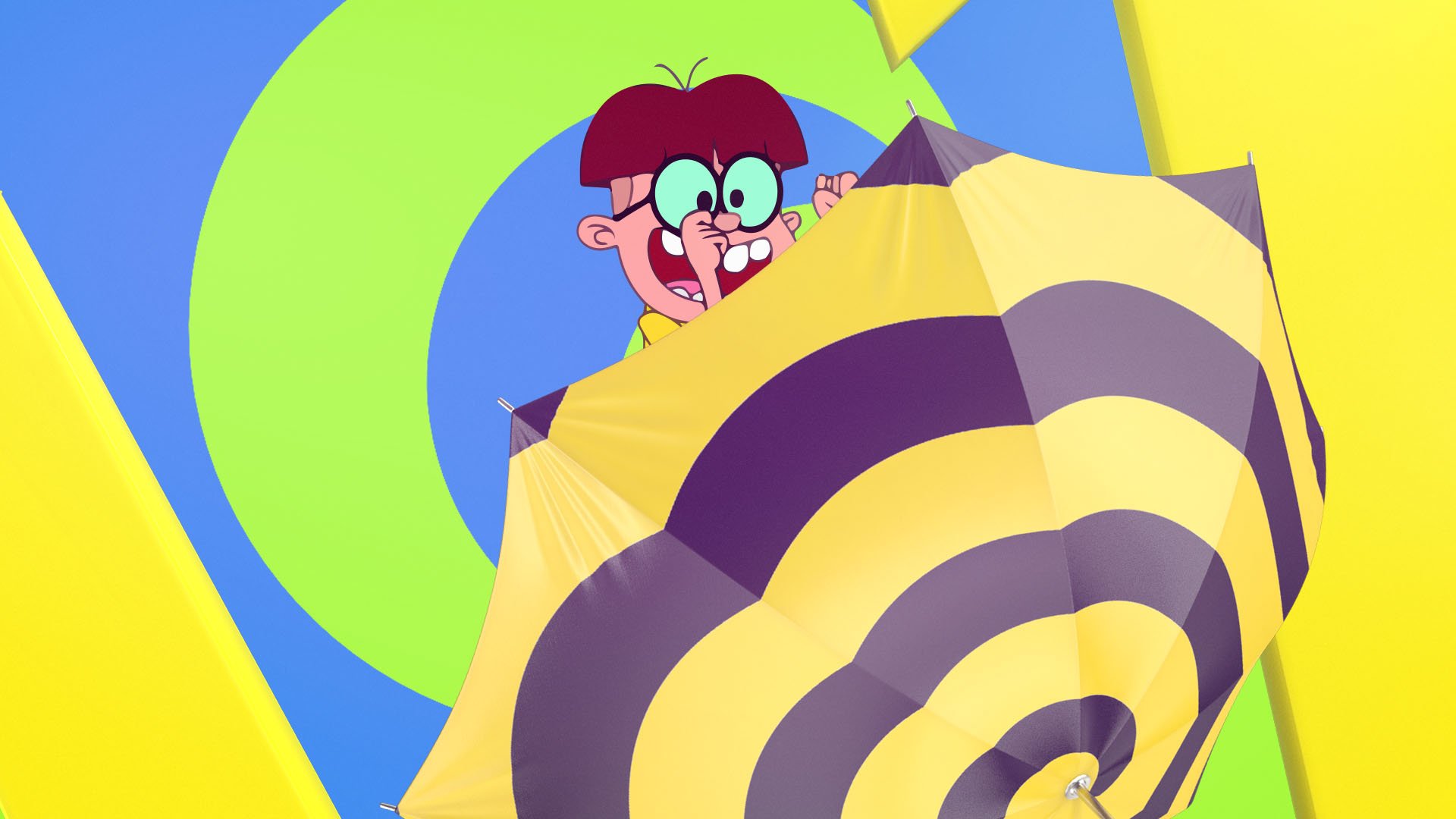
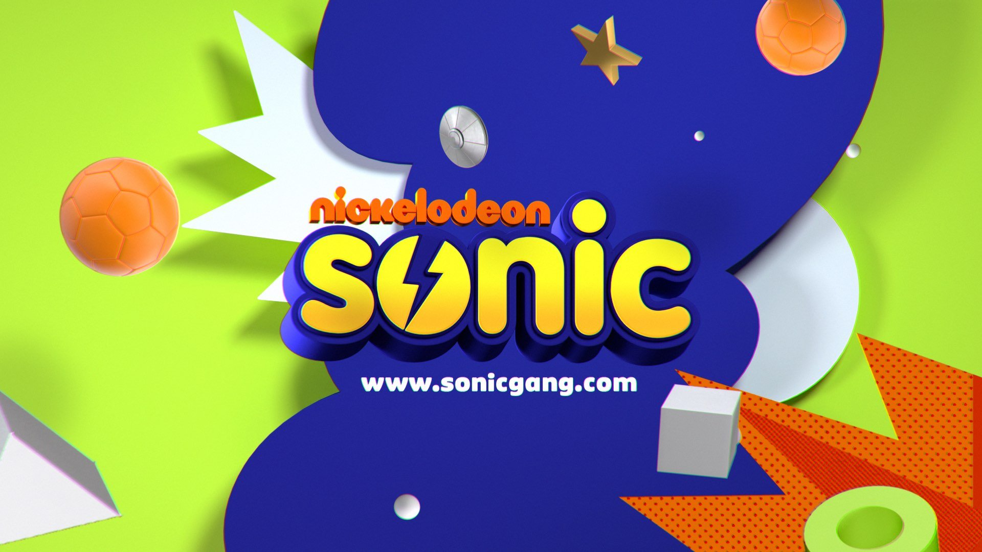
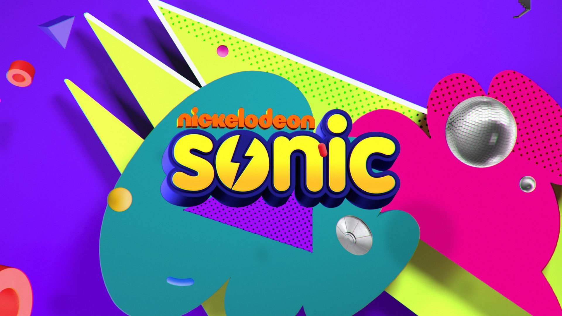
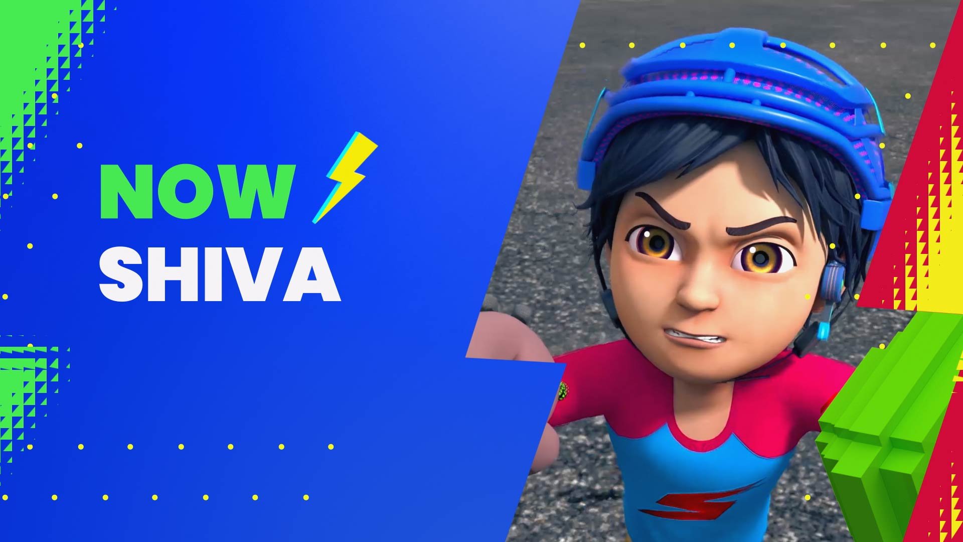
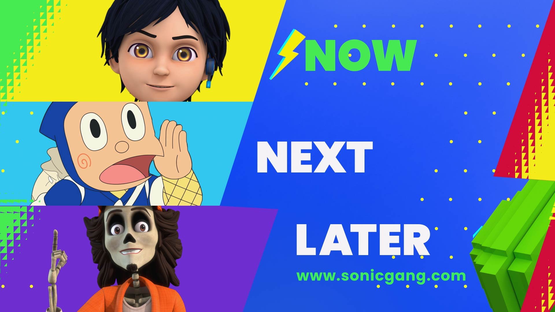
Sonic, one of the most popular kids’ channels in India came to Adolescent for a full on-air rebrand. Our concept ‘MY SONIC’ presents a slice of life and highlights experiencing life in a fun youthful way full of imagination and comedy as kids do. This personalized style brings Sonic into everyday life and is playful with quirks that kids can identify with. The new look is inspired by social media aesthetics kids use everyday and the customizable aspects of AR / VR technologies. The viewers step into the world of Sonic with the logo mark triggered by the Sonic spark icon. Kid-centric objects, patterns, and graphics create visually engaging content, allowing for a unique content experience with strong brand reinforcements.
GENERAL BRAND ID
SUMMER BRAND ID
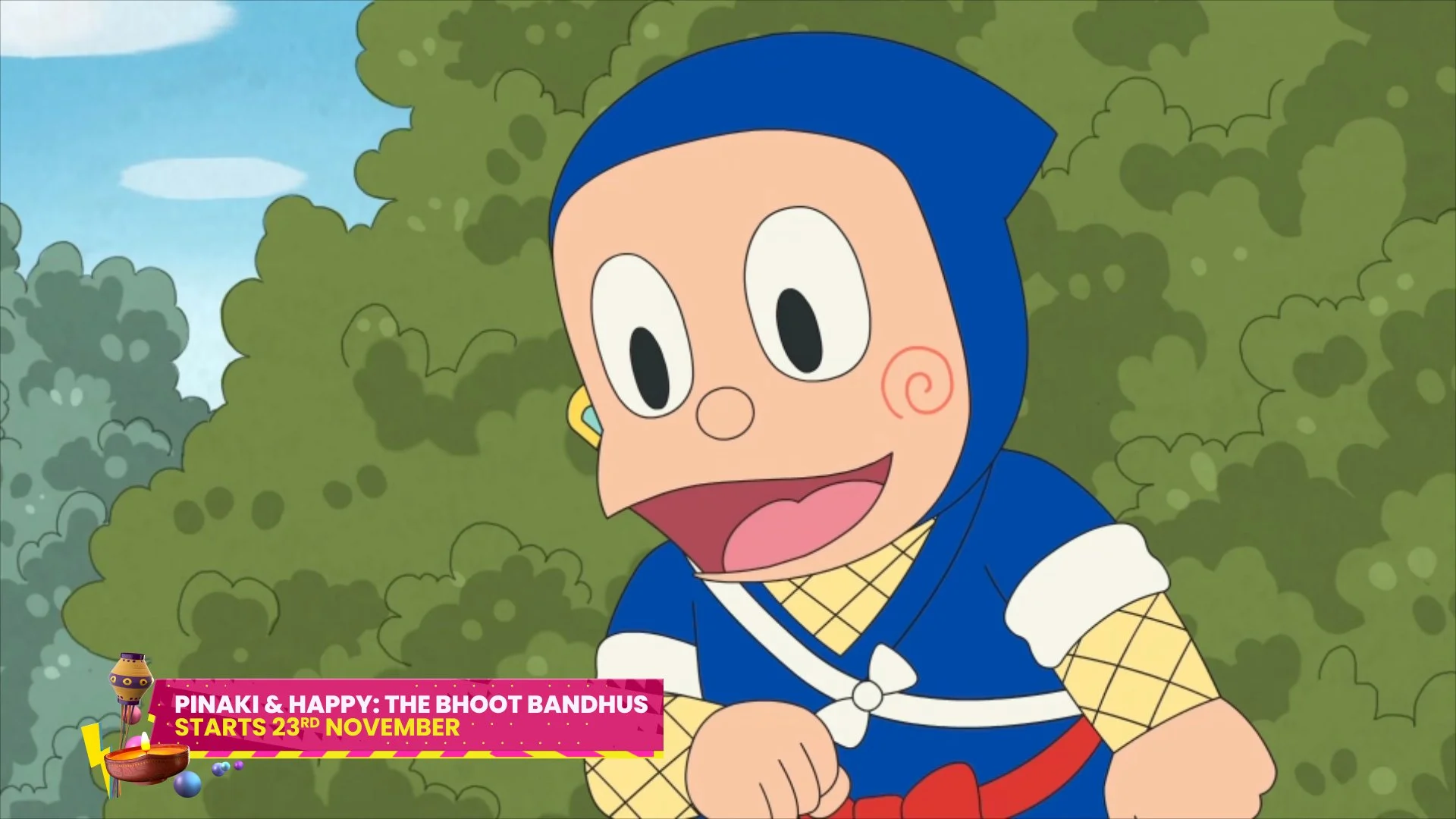
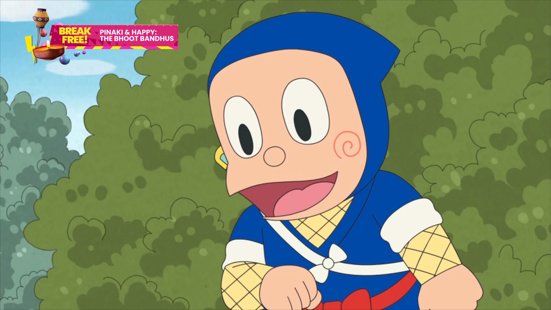
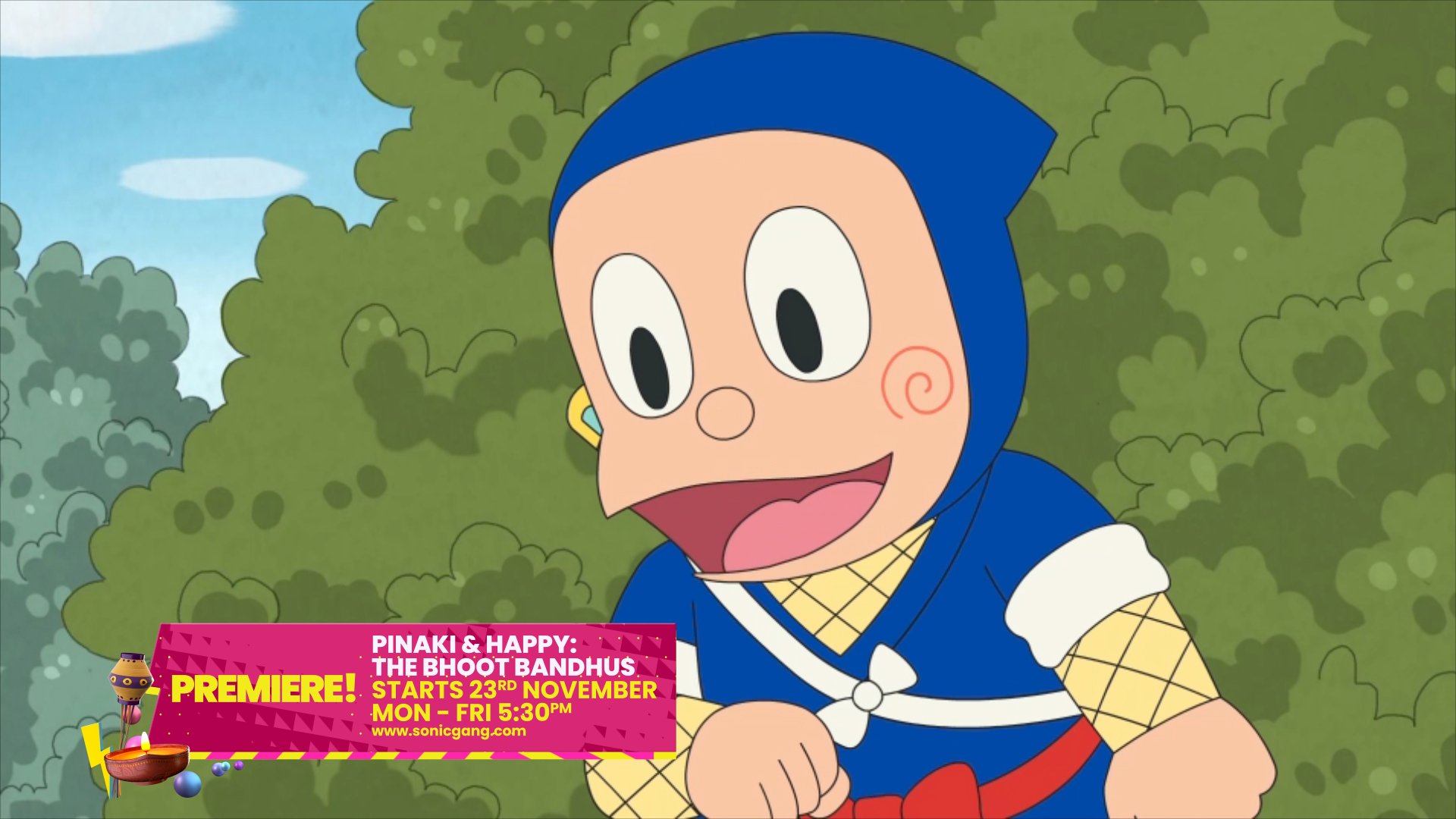
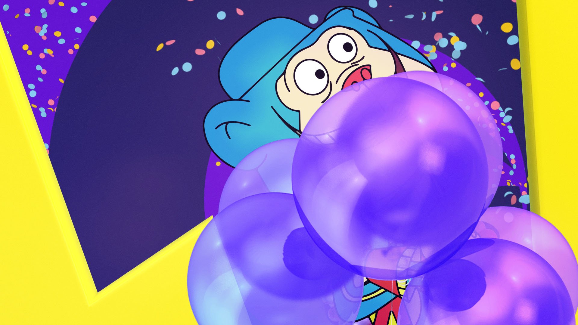
FESTIVE BRAND ID
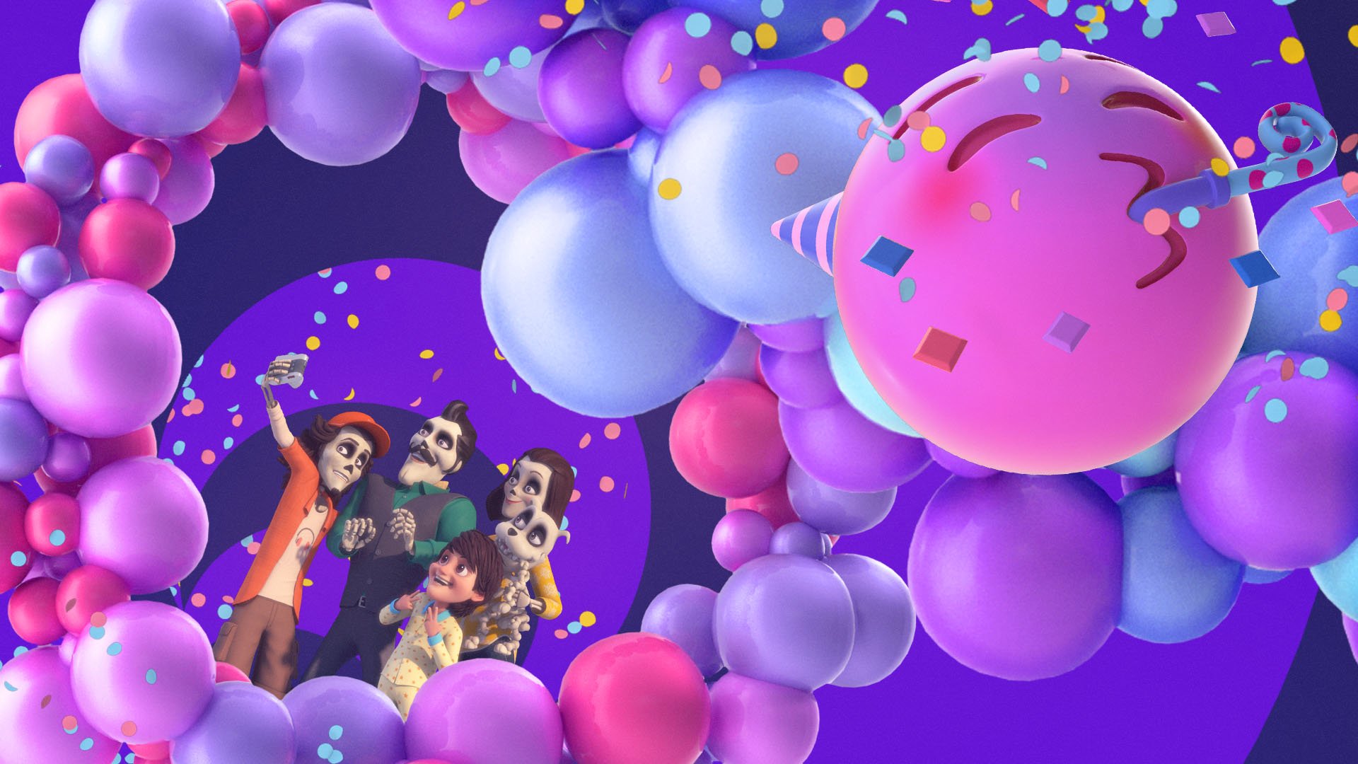
MOVIE BRAND ID
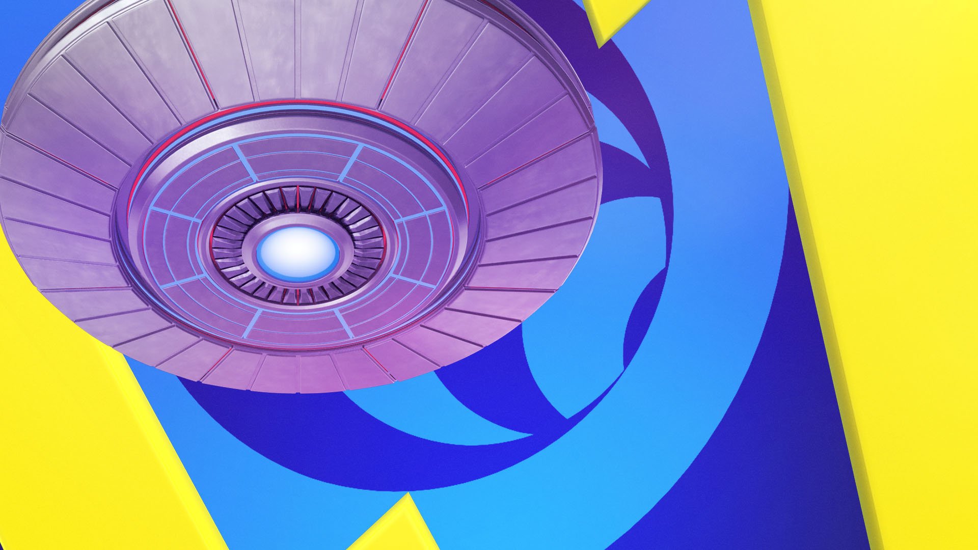
VISUAL IDENTITY
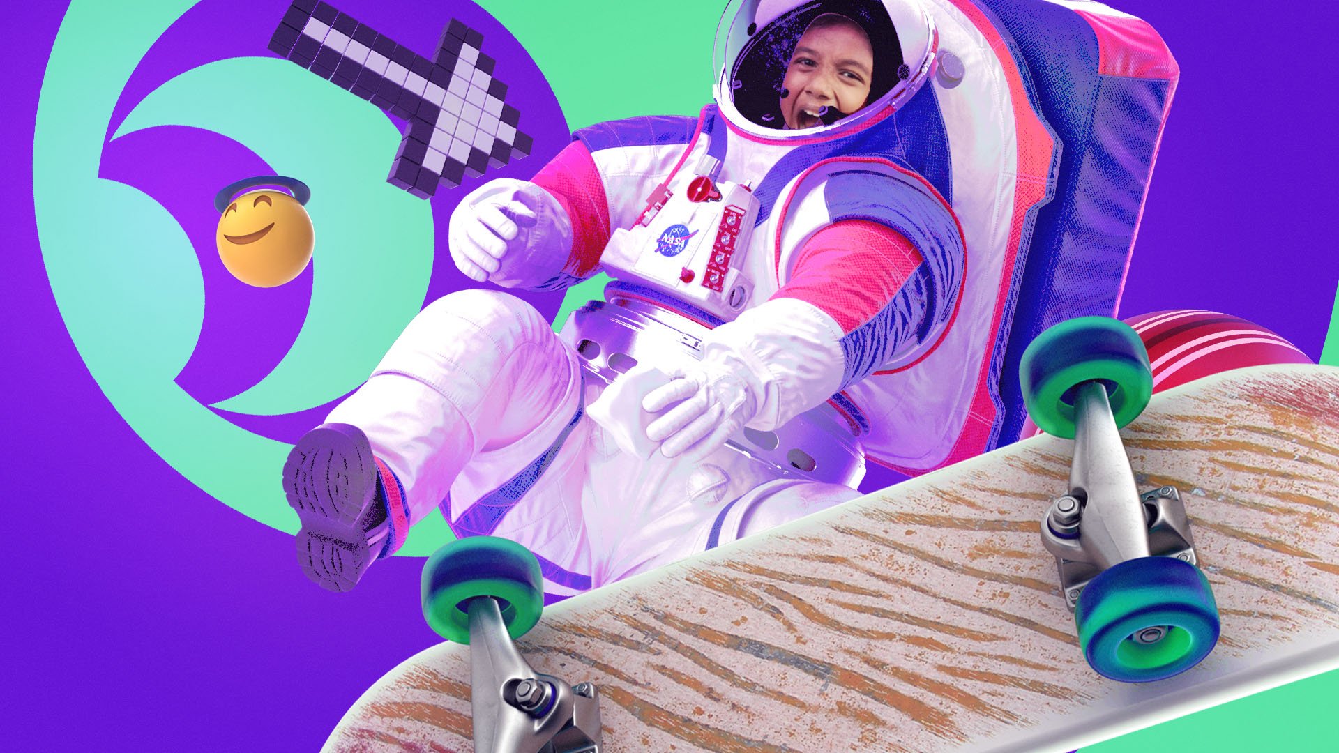
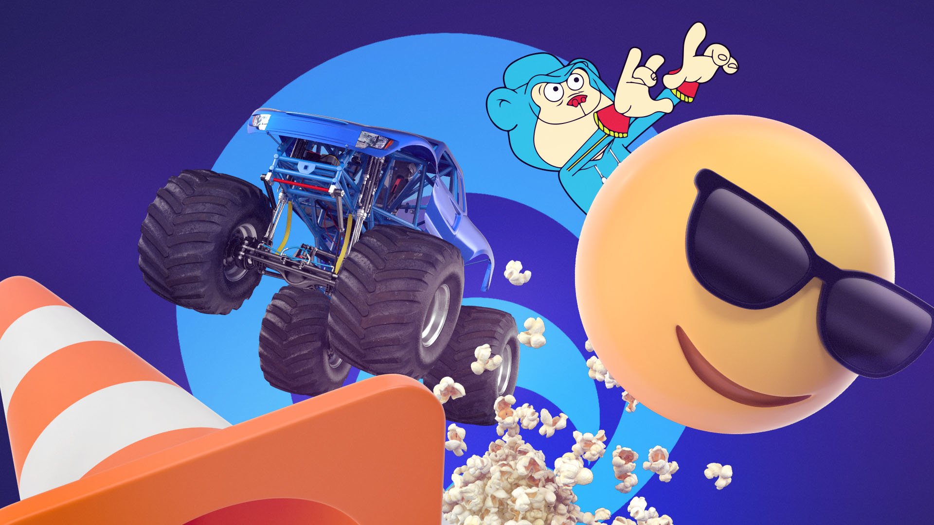
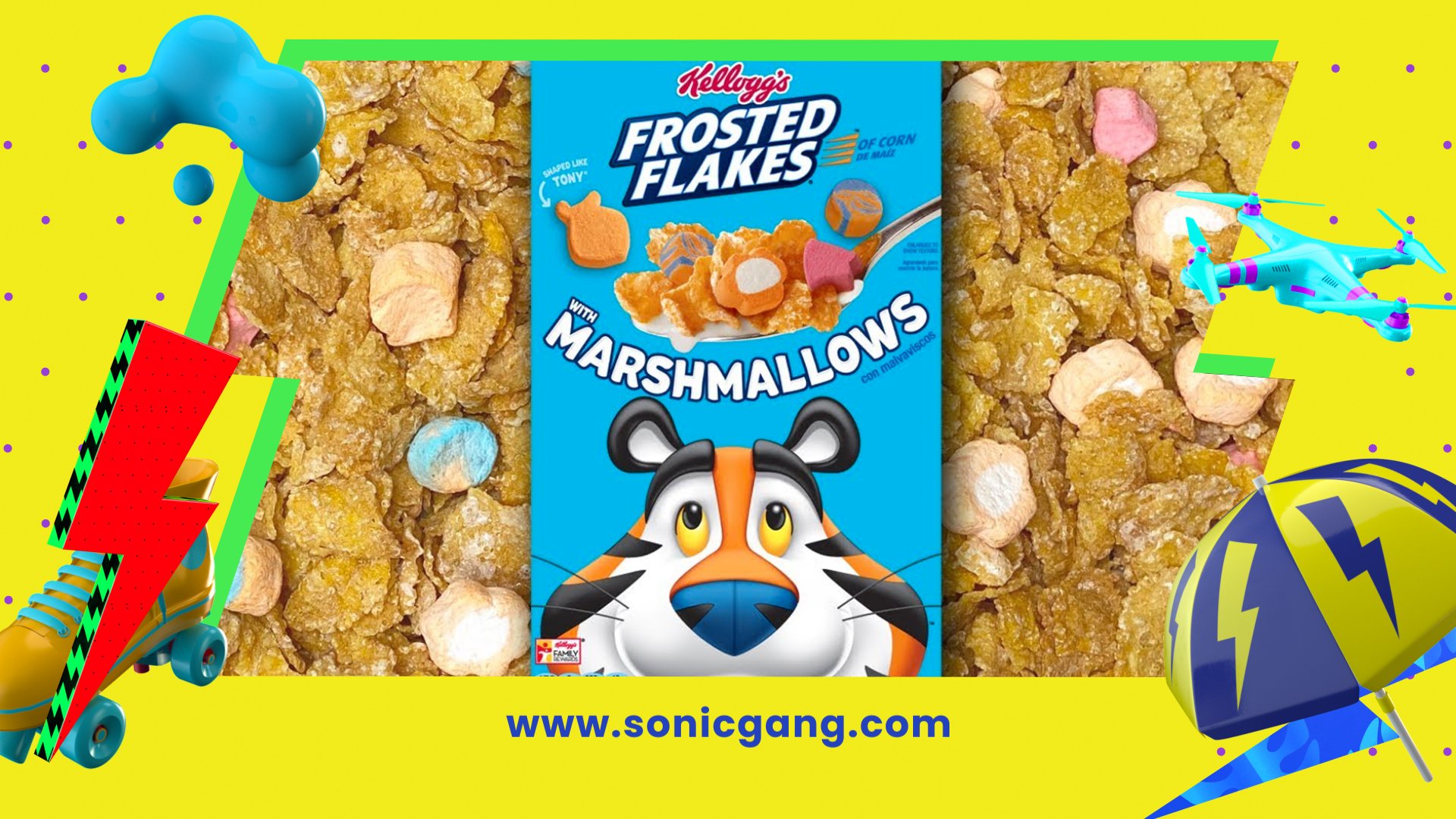
We created a simple system of colors, textures, and graphic overlays for use throughout the channel. The new brand identity’s mixed media, tactile, fun, and colorful style lets the kids own and be a part of the Sonic world. 3D visual elements combined with footage of various kids create exciting, personalized content.

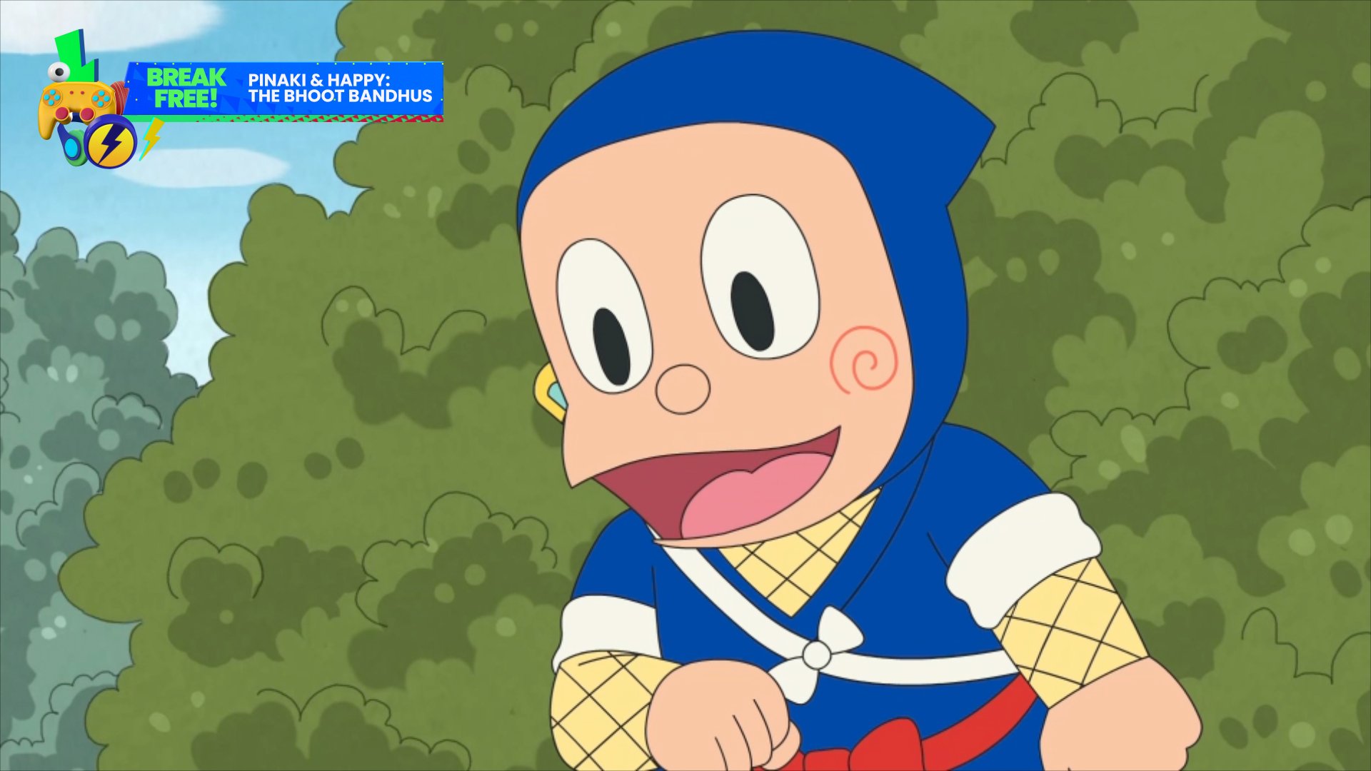
CREATIVE DEVELOPMENT
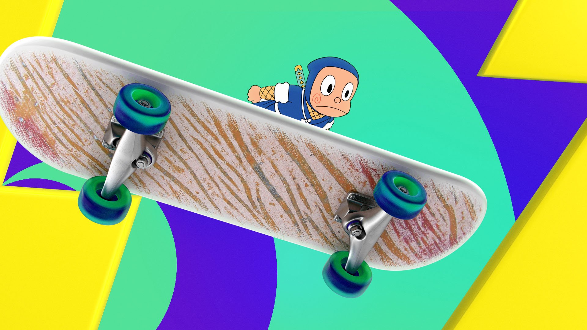
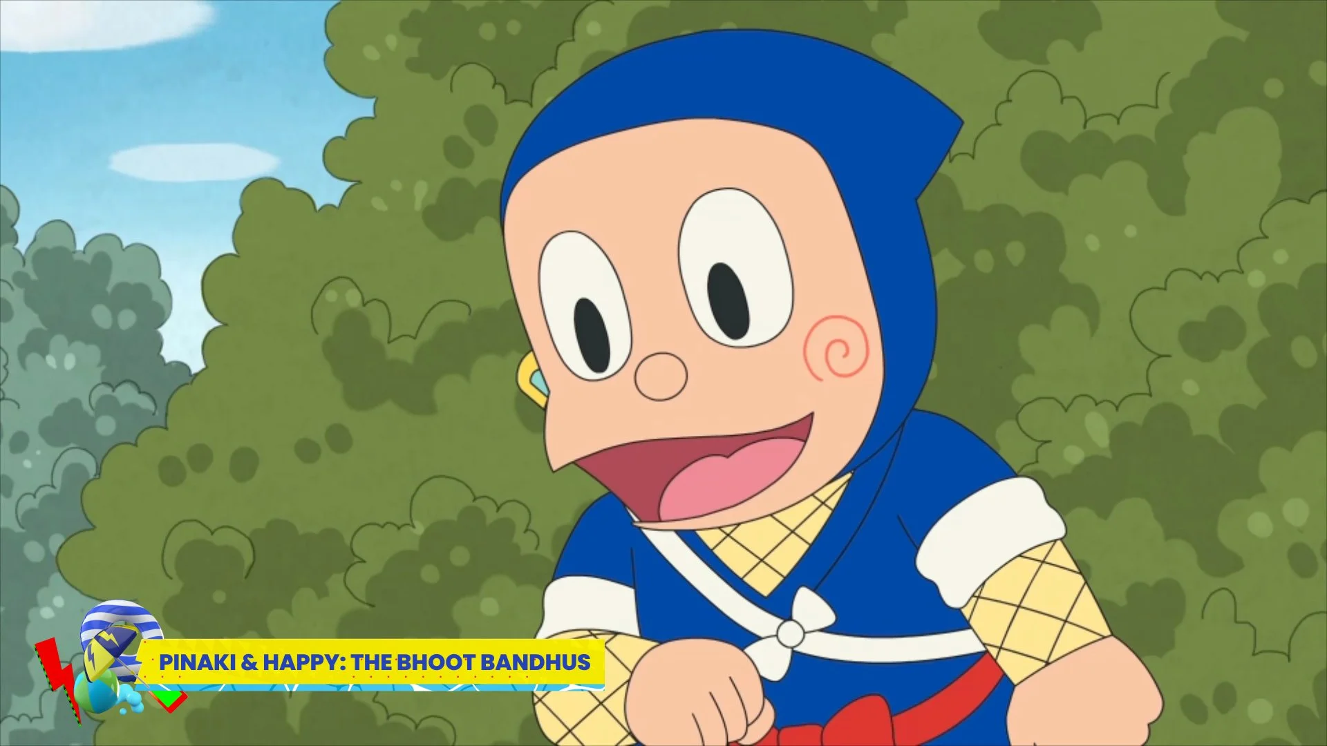
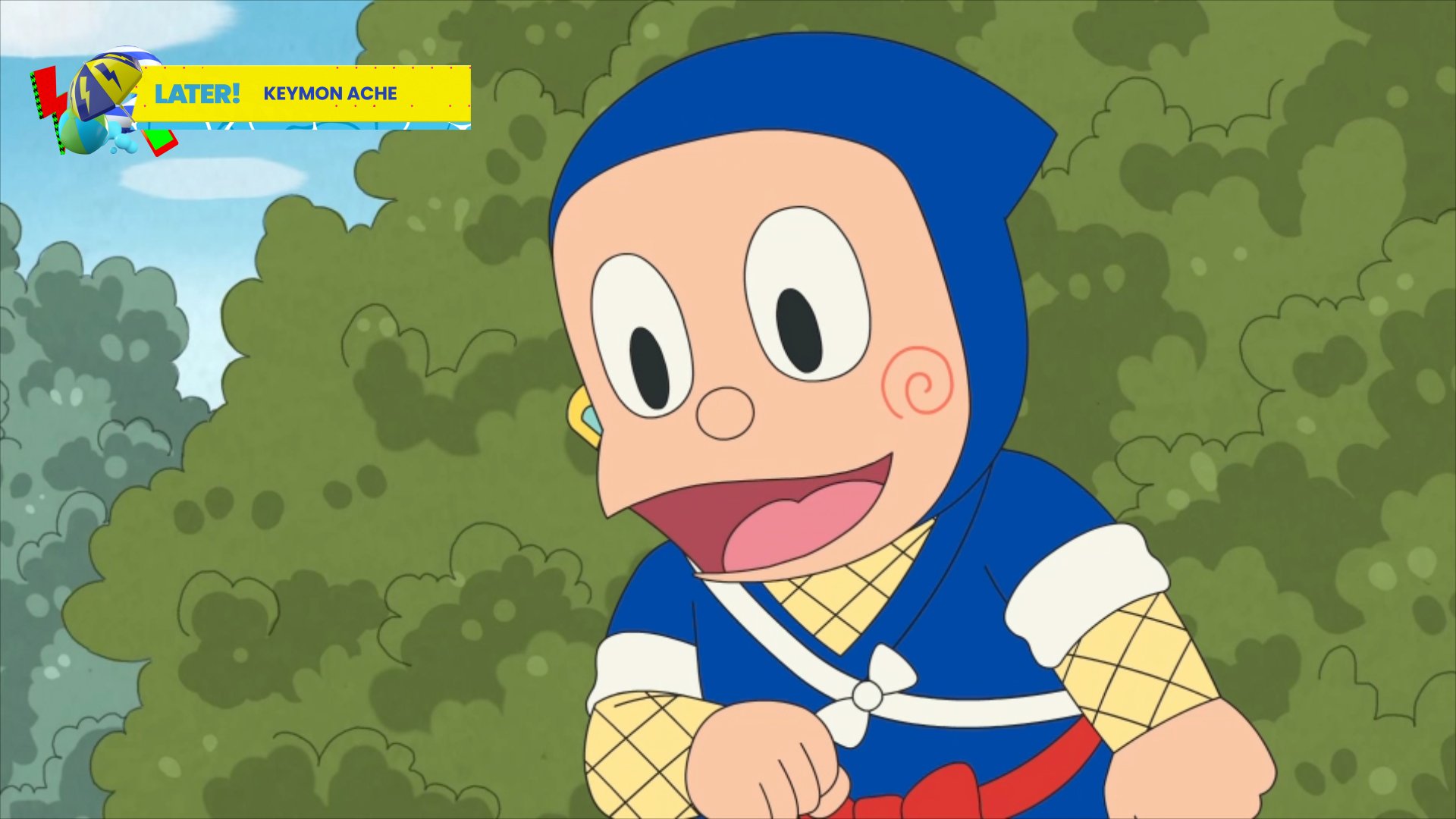
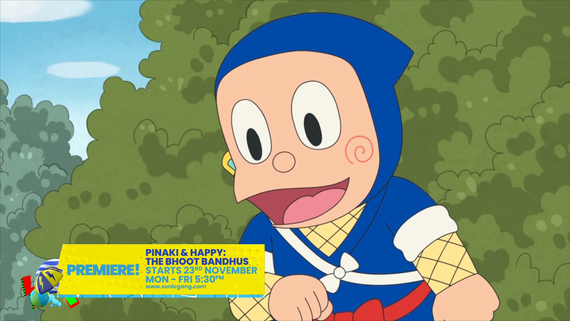
Assets are pulled from show content and constructed to feel connected to the channel. Quick, punchy animations highlight the upbeat energy and emphasize the comedy of the show content and Sonic brand.
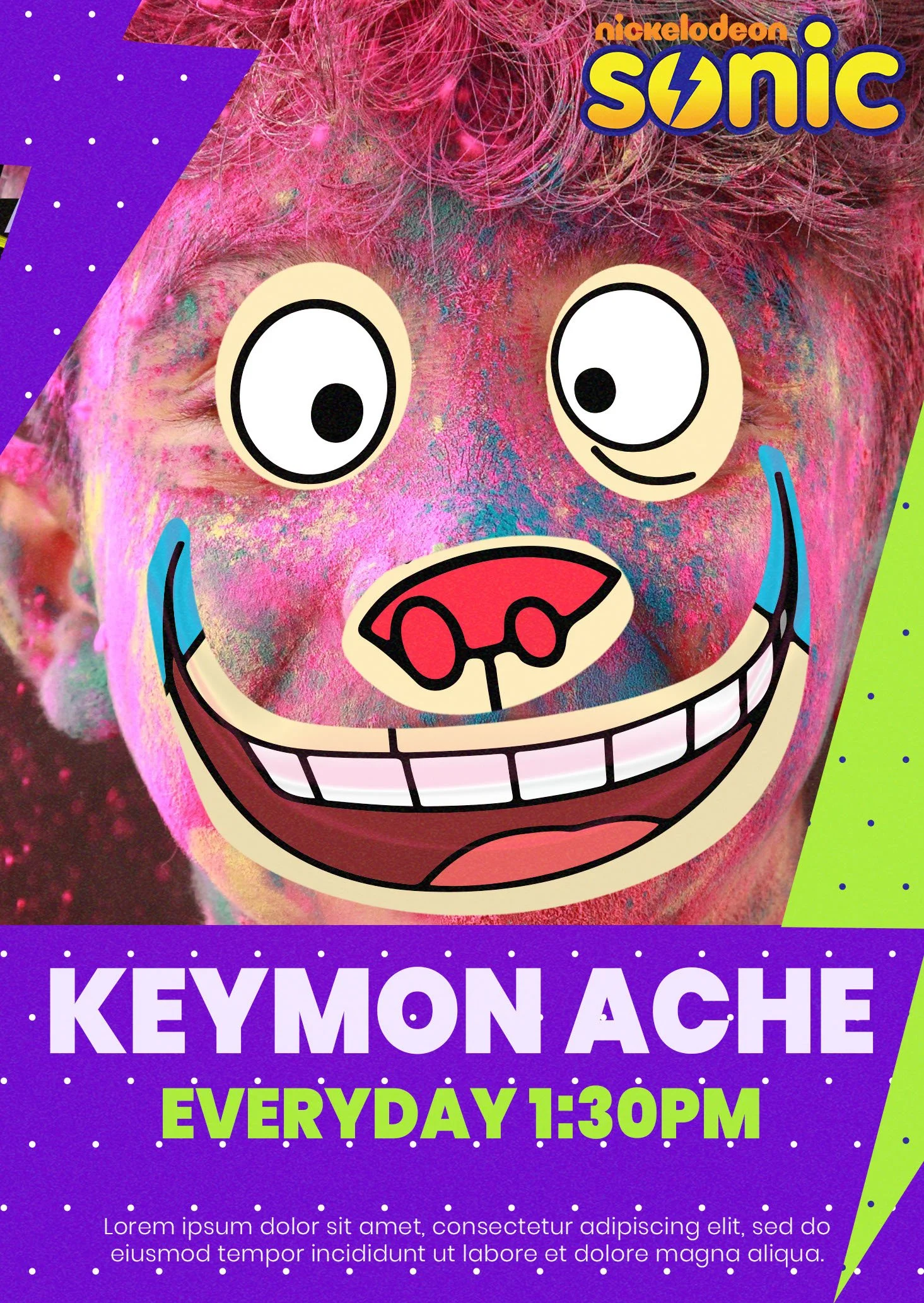
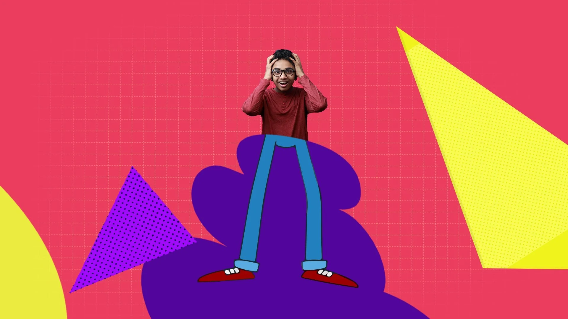
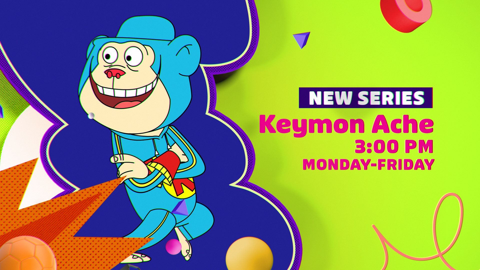
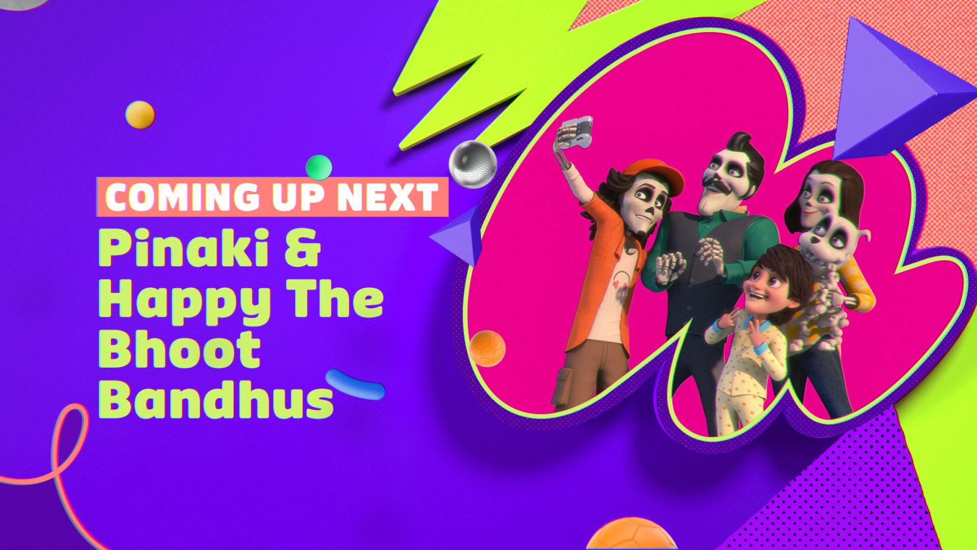
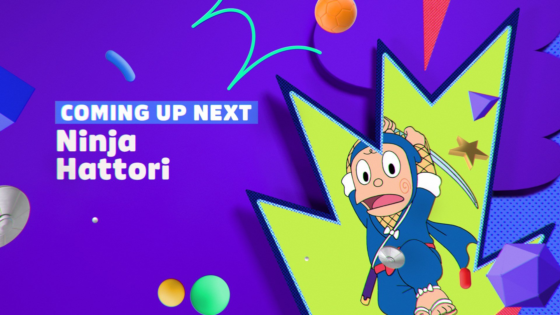
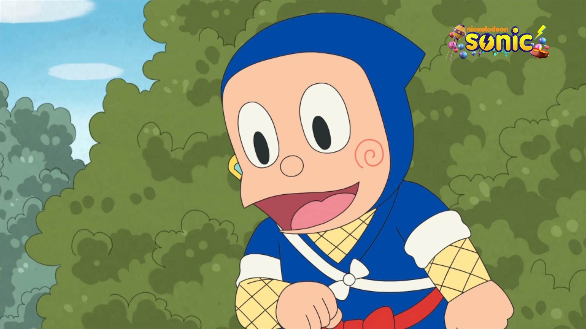
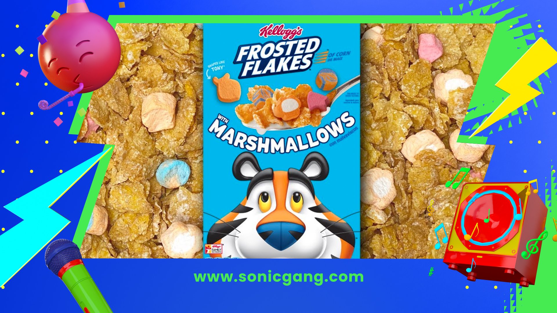
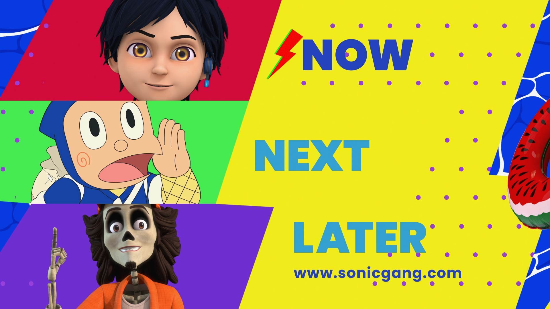
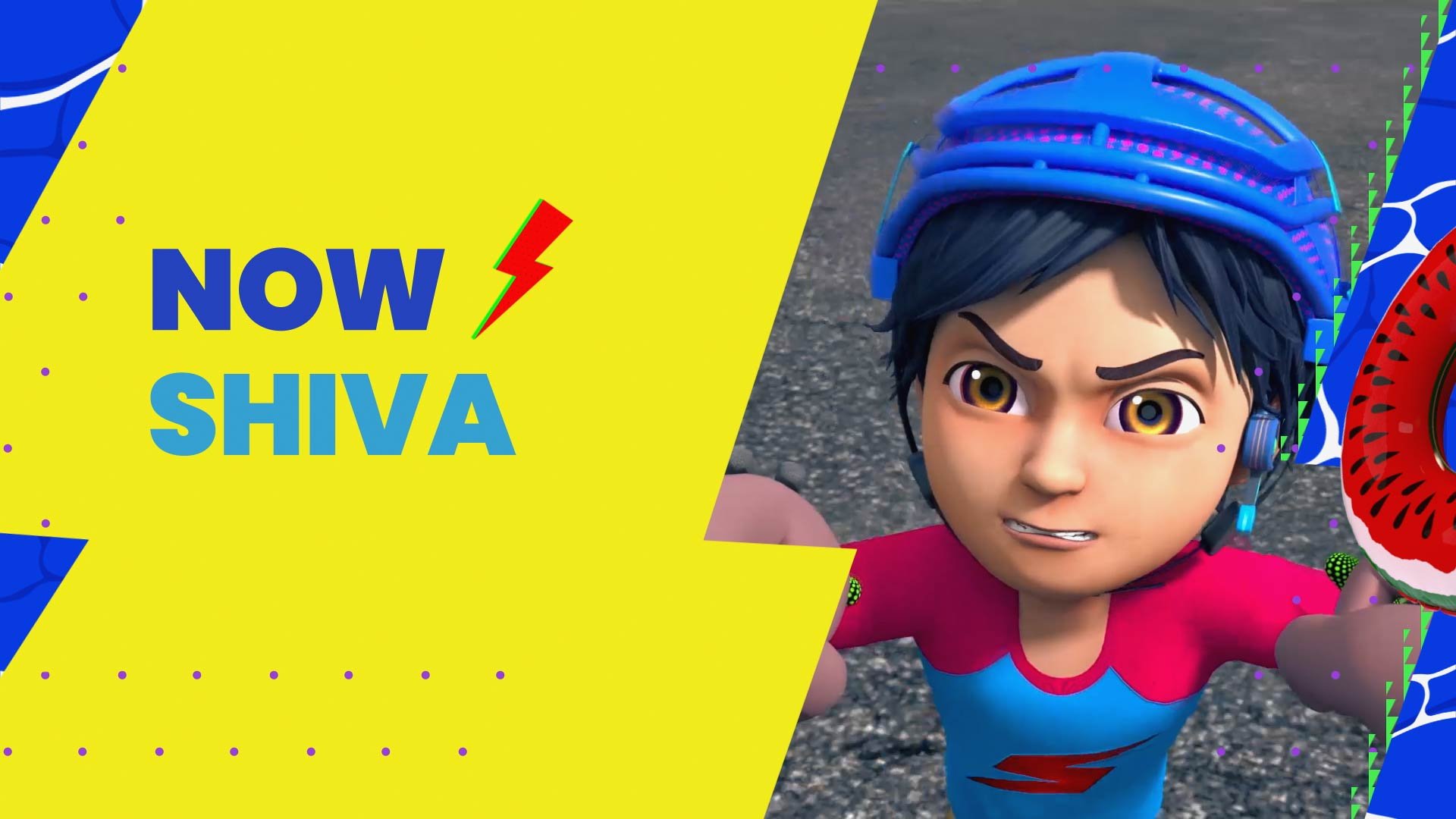
GENERAL BRAND & PROMO GRAPHICS
LOGO & CHARACTERS IDS
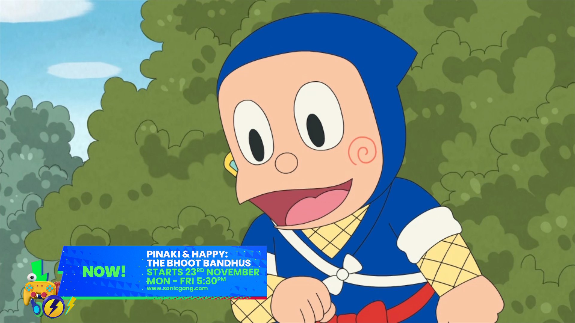
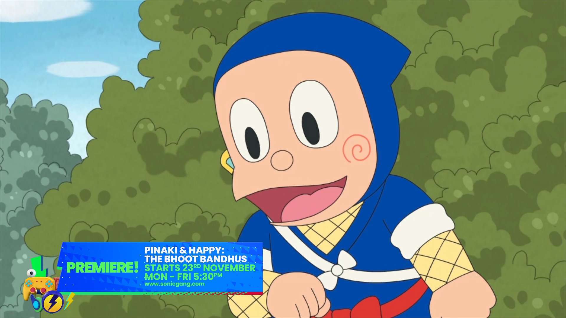
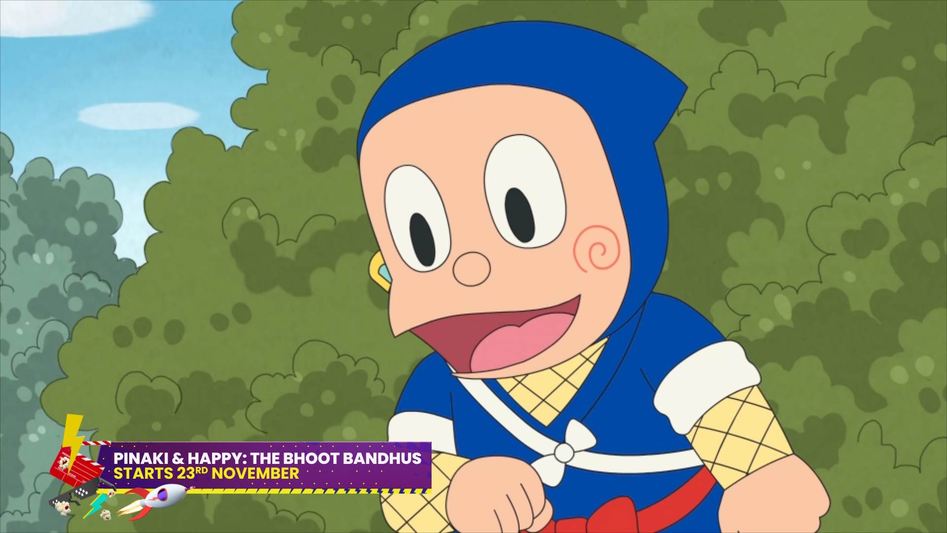
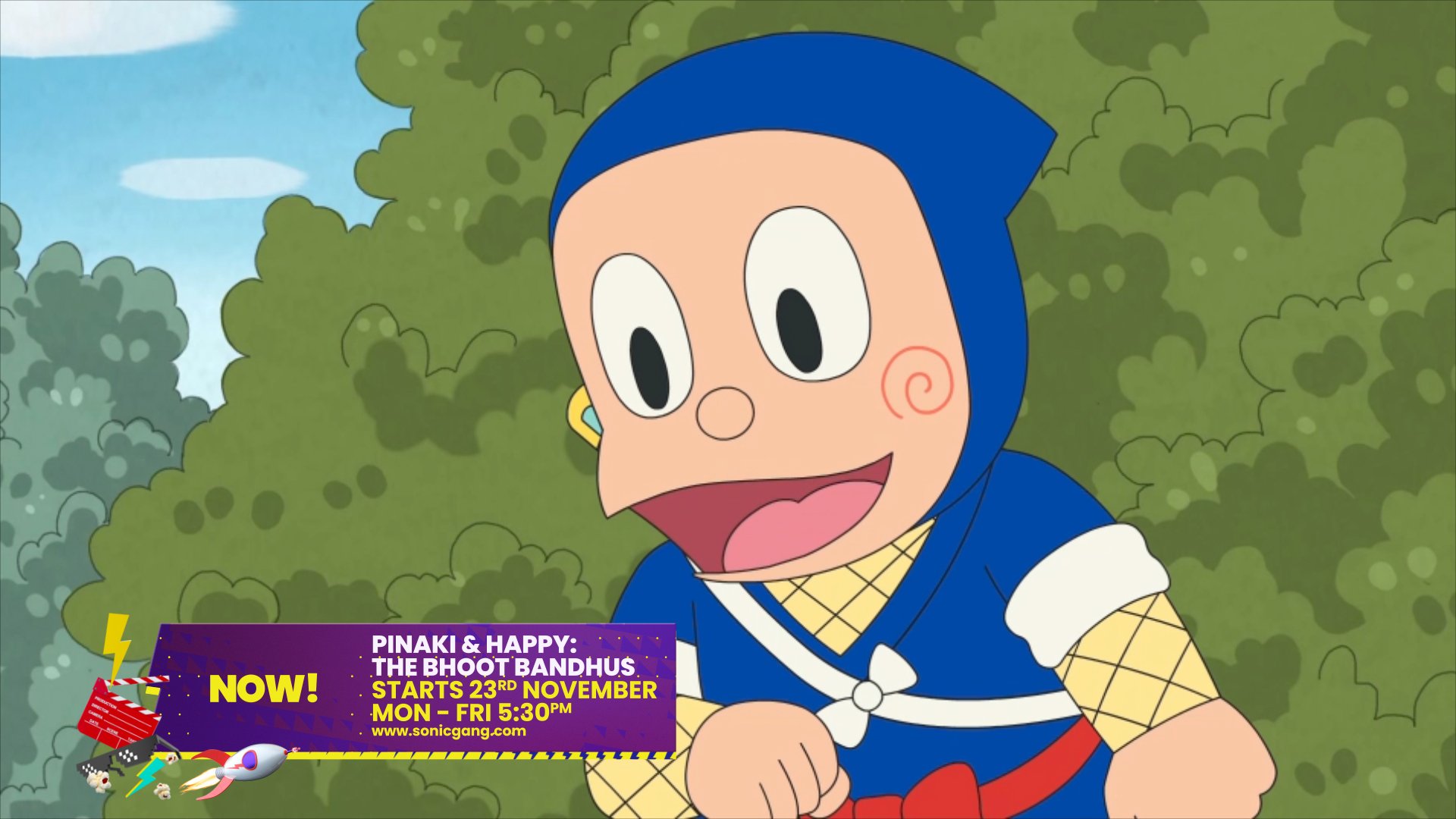
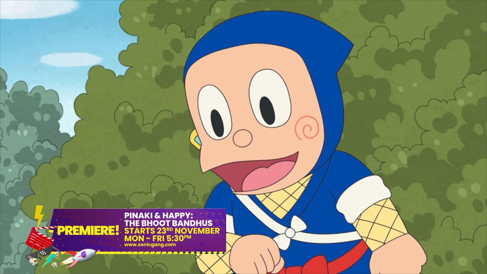
PROMO GRAPHICS


SUMMER BRAND GRAPHICS
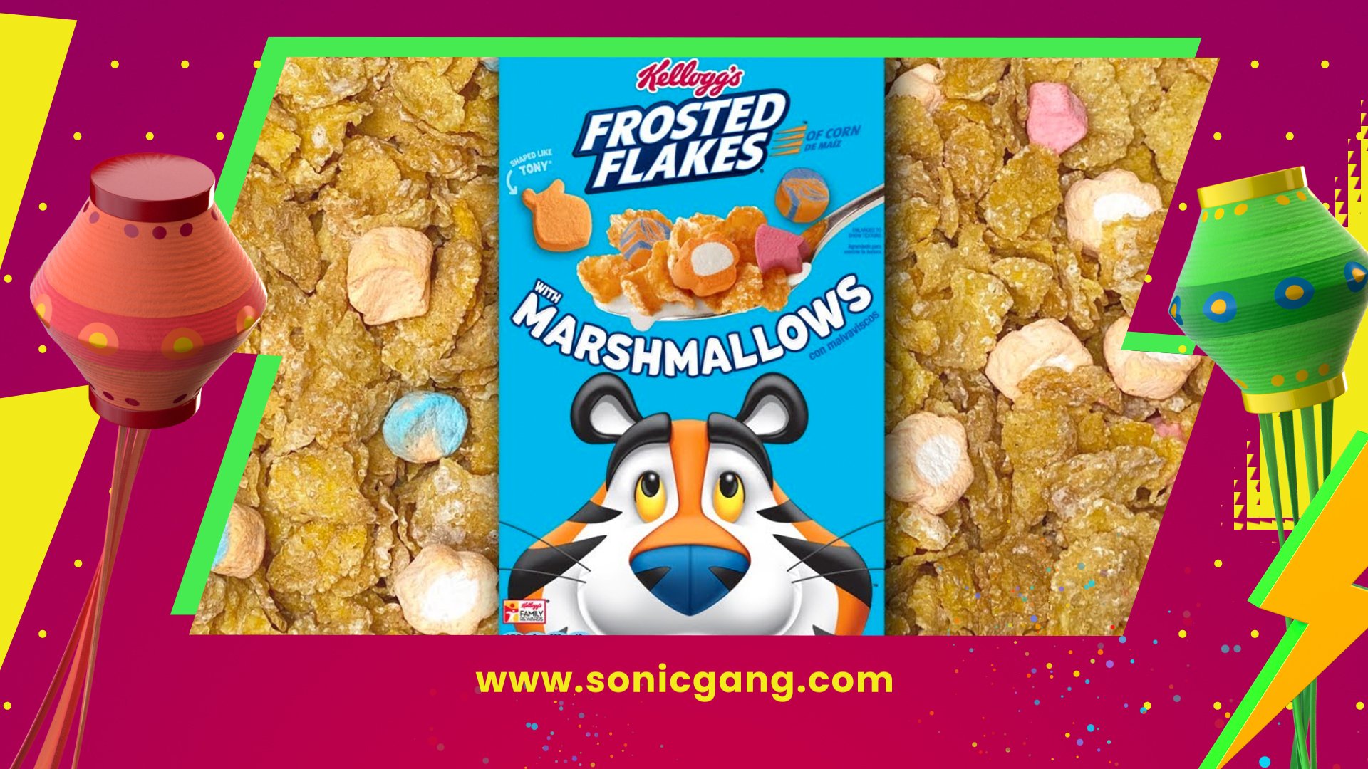
Each season on the channel has its own branded package - from general to summer, movie, and festive which help distinguish special occasions from regular programming, and give that extra payoff for tuning in.
LOGO & CHARACTERS IDS
PROMO GRAPHICS

MOVIE BRAND GRAPHICS
PROMO GRAPHICS

FESTIVE BRAND GRAPHICS
PROMO GRAPHICS