Warby in 100 Words / Branded Content
Warby Parker / TIFF
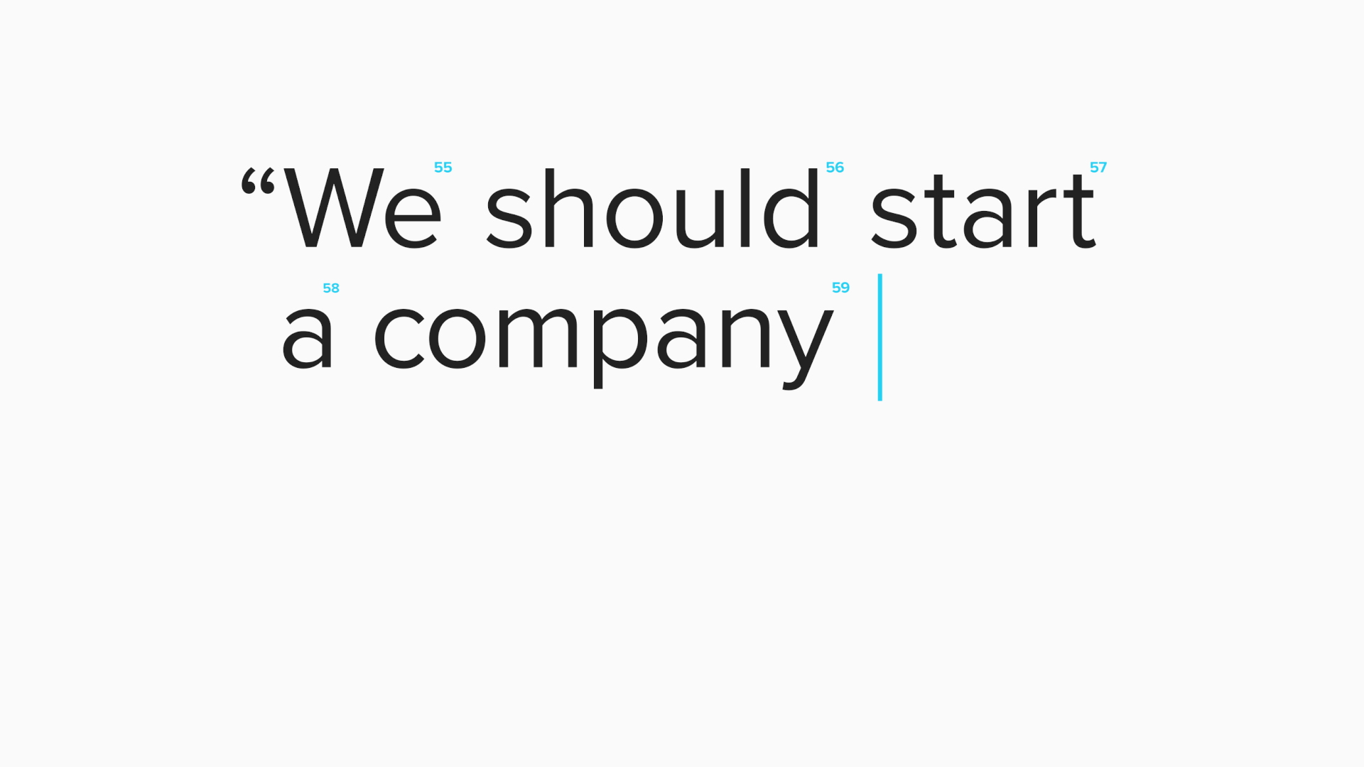
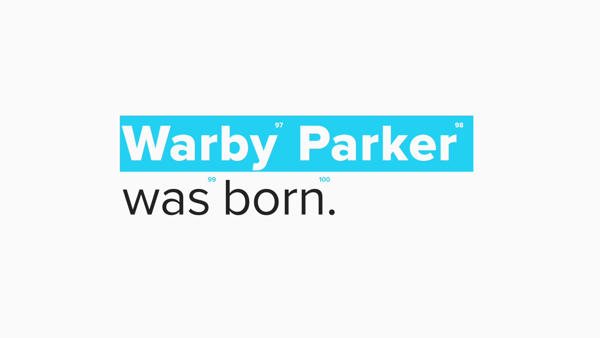
Warby Parker joined forces with the Toronto International Film Festival as presenting partner, specifically for this year’s festival series about Books on Film. We were brought on to animate a branded content piece of Warby Parker’s 100 word spot that would screen in the theater, throughout the duration of the Books on Film series. The focus was to create something snappy, witty, and of course legible as these 100 words convey the story of the company’s founding from the very beginning.


DESIGN
The design was focused around Warby Parker’s existing branding, but seen in a way like never before. A stylish typeface, based within a modern color palette unique to Warby Parker.
Since there are many more words to process than would be allowed on one screen at a time, to further reinforce the concept of 100 words, the accent of subtle numbers above each letter create a nice payoff as you watch the words play down.

ANIMATION
In bringing the piece to life, we knew it would not be overly complex but needed to make sure it was as entertaining as possible given it would be projected in a large film theater. To achieve this we kept things punchy yet playful. Combining the more literal typing of the words, with the highlighting / bolding and italicizing of keywords to help with legibility and of course that entertaining factor. These combined with a very fun sound design (very fitting of course) makes for a really unique piece that feels very Warby Parker.
